
The Mood Meter
case study no.2

Project overview
Project type: UX/UI, “Add a Feature”
Case study timing: 2 weeks
Role: UX/UI Designer, Researcher
Tools: FIGMA, MIRO, OW, Airtable
About: The Mood Meter is an app that combines in-depth emotional vocabulary and good habit-forming features to bring users more awareness of their emotional states. The goal of this app is based on Marc Brackett’s work to help society have higher EQ or emotional intelligence. The idea is to add a feature that enhances the app and makes the user experience more fulfilling. The choice to add a camera feature was a low-lift, high-impact addition to the app. With minimal changes to the existing structure, the interruption wouldn’t be felt by users. Instead, it would seamlessly integrate as if the feature was there all along. The camera feature would allow users to document their mood by pairing the visual aid of a photo, with the existing elements of the app of selecting a mood to log for the day.
Relevance: Emotional intelligence has been overlooked over the years, yet crucial to the success of human interactions. The work that Marc Brackett has done in the world of EQ has provided a framework and glossary that has been translated into a curriculum for young kids to better understand their emotions. However, kids aren’t the only group that can benefit from having a high EQ. This app, The Mood Meter, extends this knowledge and awareness of EQ tracking to all.
The importance lies in the overwhelming need to understand our emotions to improve our mental health. It’s needed more now than ever before!

Quick Links
The Design Breif
Problem
One of the great challenges in accurately understanding our emotional state lies in the fact that we tend to rely solely on a limited glossary of emotions and feelings to communicate and make sense of how we feel.
While such tools can certainly be helpful, a key issue here is that we are missing a crucial component that helps us to see our emotional state on a deeper level: the visual component.
Project Goal
Adding another layer of awareness and emotional intelligence (EQ) is crucial in maintaining our mental health and overall well-being. One way to heighten this awareness is by visually seeing our emotions on our faces and documenting them through the app. By recognizing our facial expressions and connecting them to our emotional states, we can gain a deeper understanding of our thoughts, feelings, and behaviors.
Furthermore, by logging this information using a mobile app, we can track our progress over time and identify patterns that may contribute to certain emotional states. This process can help us regulate our emotions more effectively and ultimately lead to a greater sense of self-awareness and EQ.
Solution
The solution is to add and implement a low-lift / high-impact camera and photo album feature to the existing app.
Plan
Use a modified version of design thinking.
This project requires a more streamlined plan. The steps that I’ve used in other case studies aren’t applicable here.
-
This project is important to me personally because this app has helped me to identify my emotional state on a deeper level. It’s given me language past happy, angry, or sad.
This project is important because long before I knew I wanted to make this career shift from graphic design to UX design I clearly recall loving this app but wanting more from it to help me continue to grow and learn a stronger EQ.
I am a visual learner and it checked a lot of the boxes I was looking for but lacked this feature of visual documentation.
It’s been exciting to use this app as a case study to now help me learn the process of UX Design.
Empathize
Why is it important to understand our emotional state? How are other apps assisting us in doing so?
In this Section
Competitive analysis
User interviews
Empathy map
User persona
Research key findings

competitive Analysis findings
The four top competitor apps all had similar features to the Mood Meter app. However, all lacked the ability to take photos and store a visual component. This was the first step to realizing that the hypothesis aligned with a gap in the market.

My simple competitor Analysis chart template.
see note below.
-
I identified a crucial obstacle in my design thinking and process while working my way through each case study.
Problem:
I noticed that when it came to presenting information I got bogged down with how it looked, versus the importance of the content. While both are important, I spent an exorbitant amount of time ensuring the design was spot on to what I thought the end design would look like. This was both a hindrance to the flow and timing of the project, as well as to the information being presented.Solution:
To overcome this obstacle, I created a basic template that I could use for other projects. Once the project was in a good place, I could revisit this template and modify the design to add more design elements to give it a tailored style for presentation purposes. This not only helped me to not get hung up on the design details but present the information in a clear timely way.


Research plan + Interviews Questions / script
I mapped out the research plan, followed by my research interview questions. Here’s what I wanted to hone in on:
Higher understanding of how users identify their emotional state.
Boots on the ground learning about apps users are utilizing to track or note their EQ / mental health.
Deep dive into the motivations behind users learning about EQ and their mental health.
-
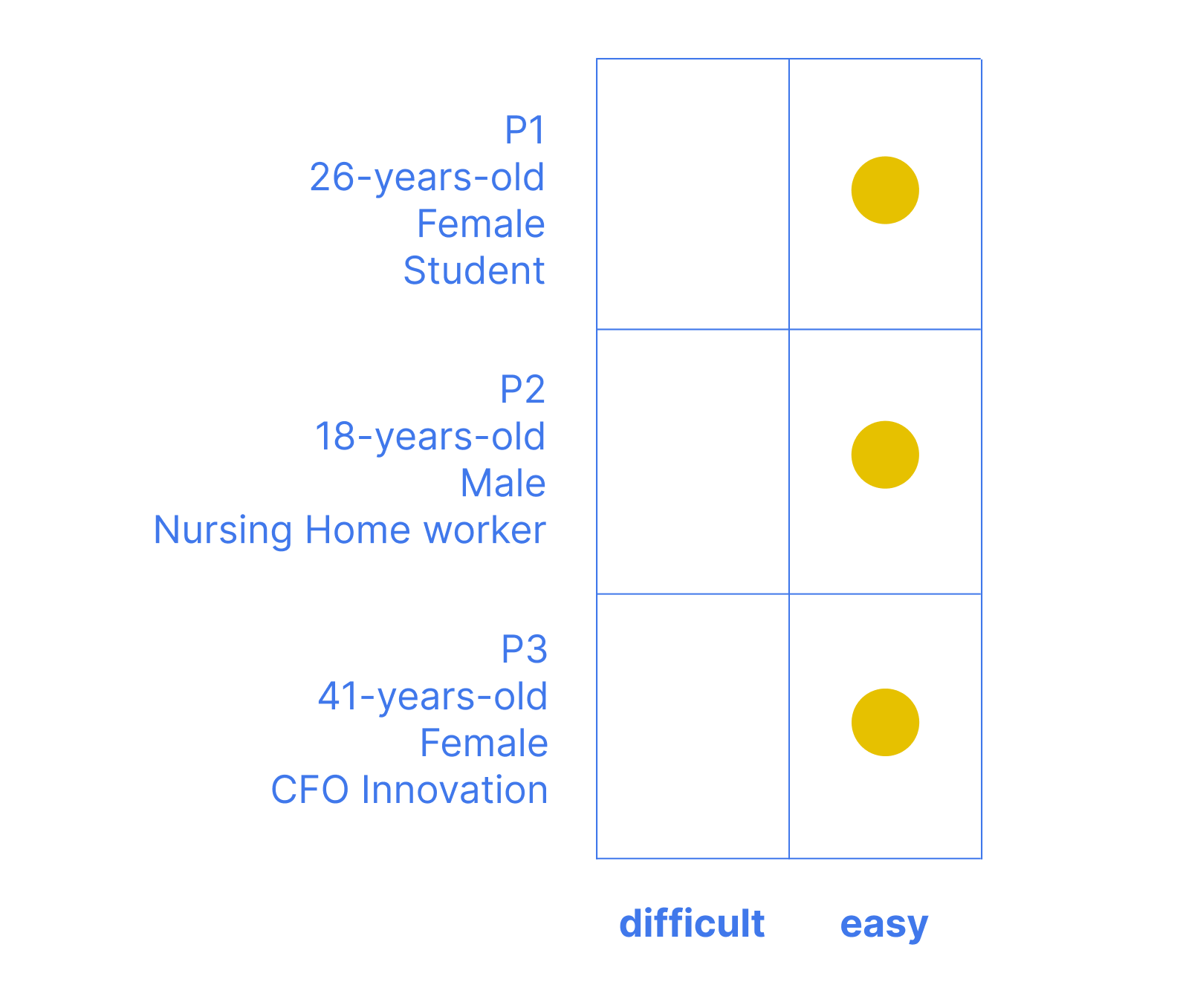
Picking the right interview candidates is critical to the success of your project. While I understand that most UX researchers will often develop a questionnaire to find the right subjects, for this project, I didn’t utilize that step. However, I did search for a diverse group of participants.
My thinking:
Emotional intelligence and mental health awareness are topics that affect every human being. While some choose to dig deeper than others, I thought that many perspectives in my research would help me build a more inclusive/accessible app for all.
See the diversity in candidates in the charts below.
3 important interview takeaways:

When participants were asked:
Q: Would a visual aid, such as the camera feature be desired and/or helpful in identifying their emotional state?
A: 100% of participants agreed that the visual aid would be helpful, regardless if they were in the practice of tracking their emotional state or mental health state.

When participants were asked:
Q: Would it be helpful to upload a photo of an image corresponding to your emotion entry?
When asked to explain their reasoning:
A: an unimus concern was presented pertaining to authenticity. responses stated that uploaded photos may not be true to the feelings being posted, more margin for faking, and not being as honest as an on-the-spot selfie.

When participants were asked:
Q: What time of day are you most likely to use an emotional tracking app?
A: While this may seem like a simple question and response, it’s huge to learn that we’ll need to be sure our design includes a camera with a flash. We want to be sure we cover all lighting situations that may arise.


Empathy map + Persona
The challenge of synthesizing the information from all my research wasn’t an easy task. By splitting the information up into my empathy map I found a harmonious balance that would represent the ideal user. It was important to make it clear that the user wanted to focus on their emotional intelligence, rather than it being a happenstance. Titling my persona, “Learning to Heal,” helped guide the persona-building phase.
Research Key Findings
The consensus based on my competitor analysis and user interviews:
Research Summary:
Users want to learn more about their own emotional state. Based on the volume of EQ / mental health apps it’s a trending topic. My user interviews were evidence to support this.
While the market is saturated with apps for this topic many are lacking a visual component, such as a camera feature.
Based on my user interviews it is clear that linking a visual component to the understanding of our own emotional state is more helpful than not having that feature.
Design details:
Users envision a camera icon located both in the lower navigation and within the post flow.
A flash feature will be needed to be added to the camera, to ensure photos can be taken in all lighting. The user interviews indicated that users would most likely use this app at night.
This feature is a low lift-high impact upgrade for the Mood Meter app.
Solution check:
I have checked my hypothesis to ensure that I’m on the right track to coming up with a viable solution for this project. I know two important facts:
Based on my competitor analysis there is a void in the market that the enhanced Mood Meter app can fill.
Users confirmed that the proposed added feature would benefit their quest to understand their emotional state / mental state.
Ideate
Design work doesn’t have to be perfect, it just has to be ready to discuss. — DesignLab
In this Section
Task Flow
User Flow
Low-Fidelity Wireframes
High-Fidelity Wireframes
Prototype
Task flow + USER FLOW

Task Flow
Prior to the camera feature being added the task flow had one entry point. With the addition of the camera button being added to the lower navigation, opens a new line of entry into the task flow.

User Flow
I stress the importance of reducing the number of decisions users have to make in order to have the gratification of the final outcome. The placement of the camera button in the lower navigation streamlines the decision-making for the user. They can jump right into taking a selfie and logging their post.
Lo-FI + Hi-Fi Wireframes

Screenshots of Current app
Before jumping into the wireframing process I decided to screenshot all the existing screens. Laying them out in order helped me build out my lo-fi wireframe sketches. Knowing what screens will be modified, as well as, what screens will need to be added to align my new feature design with my task and user flow.

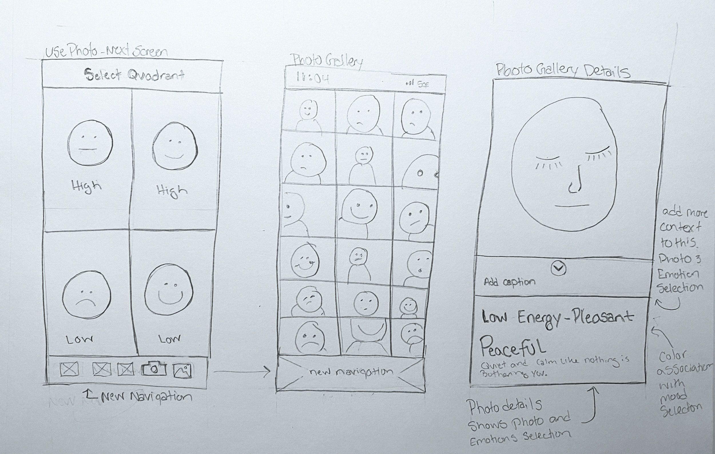
Lo-fi wireframe sketches
Pencil and paper wireframes are down and dirty and get the job done. It’s important to step away from the computer and just let your hand connect with your brain. I find ideas spill out rapidly, which allows me to work through potential problems sooner. Here are my lo-fi wireframes, I was able to make these sketches in 30 minutes or less. They provided the framework for my high-fi wireframes.
-
Let’s talk about sketch stress…
While I do this to myself, I feel very self-conscious about my sketch work at times. I compare my sketches to all these Pinterest-perfect wireframes and don’t get me wrong they look lovely, but I always wonder how long it took and what authenticity got lost in the process.
All this to say, I think there’s a balance between sketches looking perfectly UX-ified and them looking a little raggedy but still communicating the point clearly and in a timely manner.
I tell myself all the time, just do the fu*king sketch and then submit the work so it can be discussed. There’s time for refinements later.

hi-fi wireframe sketches
The hi-fi wireframes took me for a loop. As I was in the process of re-creating the lo-fi wireframes I noticed I overlooked a few important elements pertaining to the lower navigation. See below for the detailed breakdown.
The details
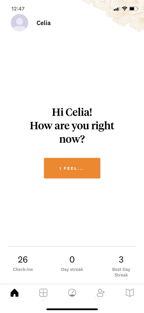
Before getting into wireframing I pictured the home screen navigation being the only change. As you can see the whole home screen took a new form and was modified after my usability testing.
In keeping with the color-blocking theme I continued this by utilizing the color blocks as buttons. This was modified in my priority revisions. It was said that these buttons appeared to be floating. So I grounded the whole section by adding a color block behind the welcome verbiage.
Lastly, by adding the iconography from previous screens I added the camera icon to the main home screen, this clearly depicts the two entry points that my task and user flow layout.

Home screen before

Home screen after

Home screen after
priority Revisions
a little speed bump…
What is important to note is that these decisions were critical to the usability of the overall app.
As I was in the process of designing the navigation I realized adding two new button icons to this space would prohibit the proper spacing needed for a user’s fingertip.
I knew from my user interviews that the placement of adding the camera icon and eventually adding the album icon needed to be in the lower navigation bar. So after consulting a group critique, I decided the “library” and “sharing” icons had to go. These buttons didn’t provide enough importance to the overall flow. See the video to view the contents of the Library and share icons.

Lower navigation before

Lower navigation after
Library icon contents

First round Prototype
The biggest challenge I faced when prototyping was troubleshooting how to link screens together. As a time-saving measure, I didn’t recreate all the screens from the existing app, in part because not all screens were modified. So, in my Figma file, I created invisible “touch points”, which were simple finger-tip-sized ellipses, without a fill or stroke. While I sorted out my prototype I filled them with a basic grey so that I could see them, then removed the fill so they didn’t show on the final prototype. I was able to link all my screens together as if I had recreated all the screens.
-
A benefit to having 12 years of experience as a graphic designer is the ability to quickly solve technical design problems, such as not being able to link all the screens in my prototype.
During a group critique, I asked how others were tackling this issue and everyone had their own way, so I figured this worked. I’ll improve as I go.
It may not be the best solution but it was what came to mind and kept the project moving enough to move to the next phase, usability testing.
Usability Testing
Facilitation (i.e., the ability to use emotions to guide our cognition)
In this Section
User Testing
Affinity Mapping
Priority Revisions


User Testing
The prototype is ready to test, which means we’re into the last phase of the project, user testing. I’ve created my usability testing plan document and have specified that I will conduct 1:1 FaceTime interviews to collect user testing data. Knowing the method of testing I also produced a usability testing interview question document.
The questions are comprised of qualitative and quantitative questions to give me a diverse data set to create my priority revisions.
usability test goals:
Allow the user to visually identify their emotional state through the camera addition
Improve the way the user tracks their EQ / mental health
To aid the users’ understanding through the pairing of the “selfie” with picking an emotion.
Usability Testing Results
Conducting 1:1 user interviews is a good way to collect information beyond what the participants say. By observing the participants as they follow your guided test, you can see areas where they struggle or moments of joy and peace with an interaction. See below for all my synthesized results.
Wins:
Overall the additional camera, photo album, and note tracking features are helpful and wanted.
Look and design seems clear
Navigation is clear and easy to use
Navigating the app together is simple and easy to use
Opportunities:
Need to re-word the welcome page
Make blue buttons more clearly buttons
Make the “I feel” icon more neutral
Add “upload” photo flow
Add color to navigation indicating the page selected
Enlarge some text for readability
When participants were asked:
Q: Please rate the level of ease or difficulty going through the action of taking a selfie, using the new camera feature.(1 - very easy to 10 - very difficult)

When participants were asked:
Q: Now that the welcome / home screen includes the option to take a photo of your emotional state, how likely are you to utilize this button? Explain your thoughts.(less than 50% of the time or More than 50% of the time)

Affinity Map
I completed my affinity map by grouping both comments and answers from the 1:1 user interviews. It was clear to see the three categories on which users commented. I labeled them as such; design, UI or interactions, and content. By categorizing them this way, the framework for my priority revisions was laid and all I had to do was select the most critical and execute the revision.
By making a unanimous color in my key, I selected the most important revisions based on the unanimous comments for each section.
Priority Revisions

Prototype flow before revisions.

Prototype flow after revisions.
2 Important Changes
The home screen was a large focus for the usability test participants. Not only was there confusion on the verbiage, but it was unclear what was an interaction or not. Making sure that was seamless is a big deal!
I was faced with a surprise major design change. While conducting the 1:1 interviews it became clear that users actually wanted to be able to upload a photo that correlated with their emotion. This is a deviation from my earlier research, which showed users felt that the feature would be misused. By adding this feature I changed the flow to accompany the revision, added a new screen, and changed the verbiage on the home screen to be more open-ended.

new Camera / upload screen
home screen before revisions

home screen after revisions
-
Sometimes you don’t know until you see it.
This was a very valuable lesson in trusting the process and not being stuck to the proposed outcome. Getting all the way to the end of the project and learning that users actually wanted the upload feature was so surprising.
By staying flexible and letting the data guide the project I was able to listen fully to my users and provide them the option to take a selfie or to upload a relatable photo.
Having the prototype facilitated this change, which was pretty satisfying.
