
Kaus insurance
case study no.1

Project Overview
Project type: UX/UI, Branding
Case study timing: 6 weeks
Role: UX/UI Designer, Researcher
Tools: FIGMA, MIRO, OW
About: Kaus is an insurance company with over 30 years of experience selling insurance in the B2B market. They feel confident in offering bundled packages and providing excellent customer service. Kaus believes those two components give them an edge in the market. However, to stay current with competitors Kaus is changing their business strategy to serve the B2C market. With a fresh look and new digital products, Kaus is looking to the future to ensure their customers are satisfied.
Relevance: Let us break the status quo regarding big businesses, like insurance companies. While it’s a must-have, it’s not necessary for the process to be confusing and misleading. Insurance should not only protect you, but the process should be one that makes you smile. Not only should the product help you as the customer, but it should also look relevant to the world we live in. In the age of highly curated everything, why wouldn’t that apply to an insurance company? The pairing of a fun and functional design and excellent customer service should exist for all users.

Quick Links
The Design Brief

Problem
Kaus is looking to shake things up by re-structuring their business model. They want to start selling directly to the consumers, or B2C market. To make this shift successful, Kaus is aiming to attract a younger demographic by creating a current website that emphasizes bundled package deals and exceptional customer service. One of the main reasons Kaus is making this shift is to appeal to a new market. By targeting younger consumers, Kaus hopes to increase their exposure and ideally, enjoy larger sales volume and business longevity. They believe that by creating a modern, user-friendly website and offering exceptional customer service, they can win over consumers.
Project Goal
My goal is to create an intuitive design that meets the needs and desires of our target audience from our design brief. I will rely on user testing to guide our design decisions and ensure that the website is both user-friendly and aesthetically appealing.
Solution
Design a Responsive Website! To accomplish this, I will conduct user interviews to gain insight into user behavior and preferences. This feedback will inform our market research, in which we will analyze trends and competitor strategies to identify opportunities for differentiation.
-
I find I can be impatient about starting new projects. I bull right in and lose focus. So let’s pause, take a breath, and review with some questions:
What is the project?
What are the goals?
What do we think is the best solution at this time?
How do we get there?
see in this section how I clarify these questions.
Lastly, using a blank wall and sticky notes allows me to organize my thoughts quickly.

Empathetic Appoarch
Without understanding, I can’t see beyond the problem to the other side that potentially holds the solution. Seek understanding by asking questions.
In this Section
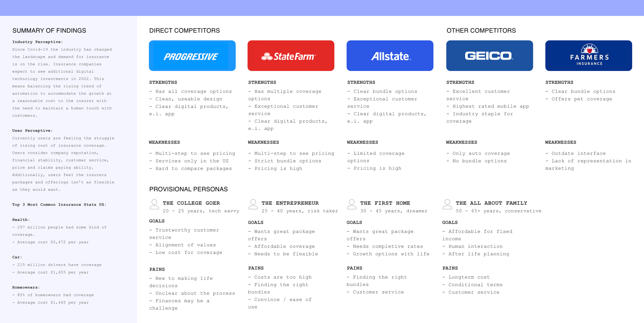
Competitive Analysis
User Interviews
User Persona
Research Key findings
competitive
analysis
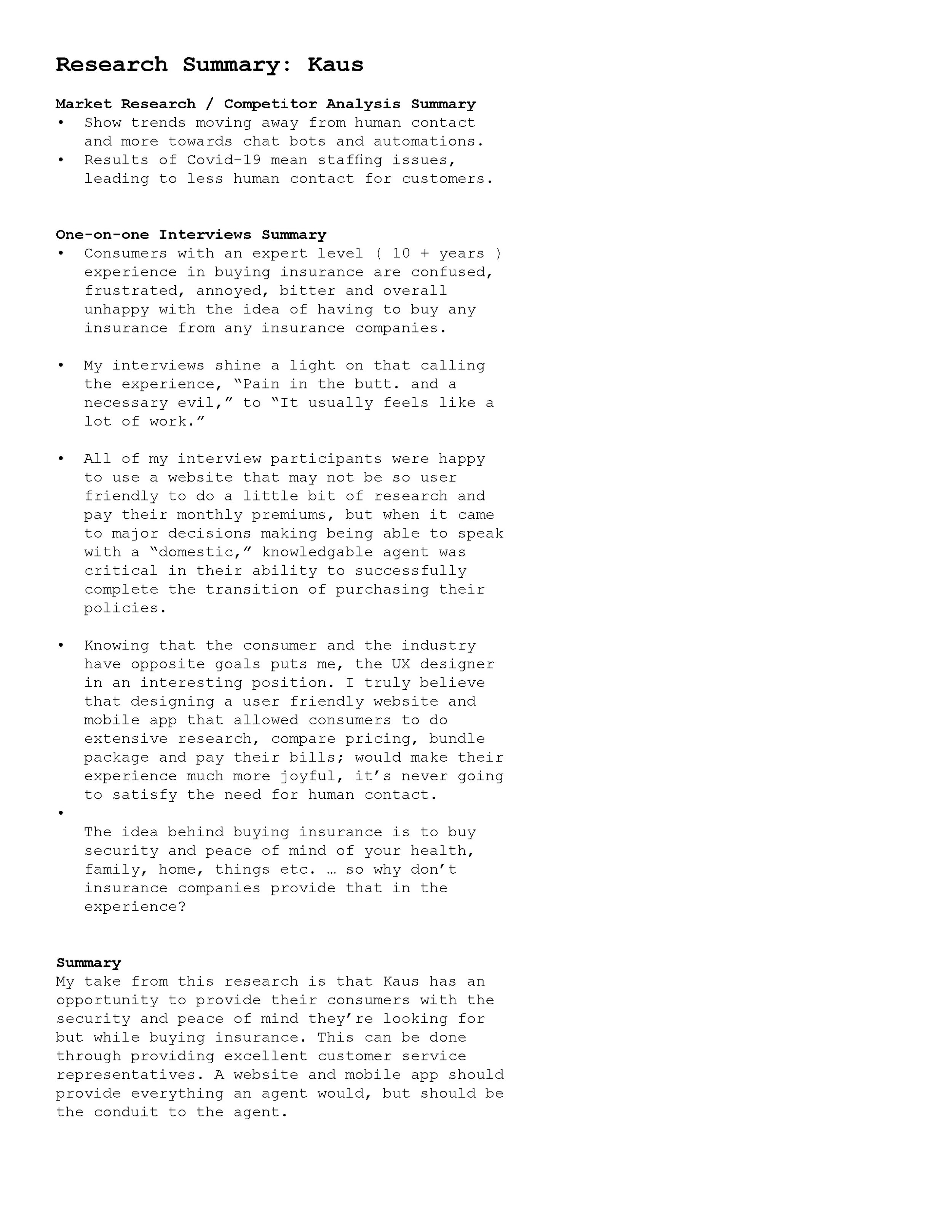
The approach to start with competitive analysis laid the framework to better understand who my direct competitors were in the insurance industry and what their strengths and weaknesses are. I could quickly see a gap in the market that our client offerings could fill.
-
I learned something really valuable from this portion of the project.
When creating my competitive analysis it’s important to look at the strengths that your competitors have, but what’s really important is finding the weaknesses.
Being a detective is crucial. This is where you find the holes in the market, and your client’s goals could be precisely what the industry is missing.

Research plan + Interviews
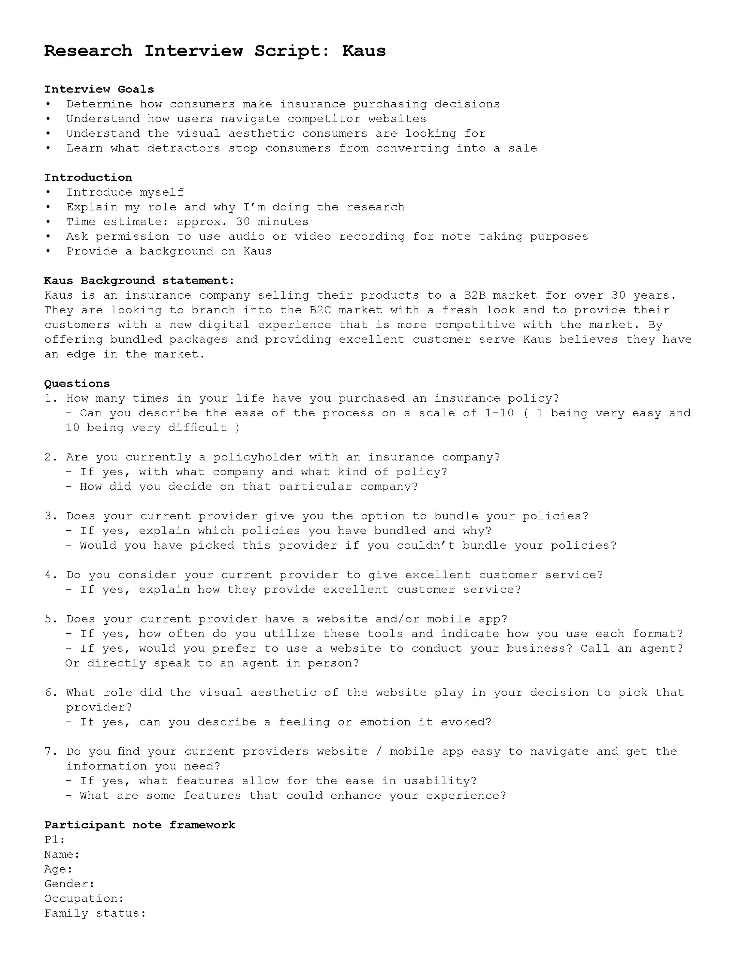
The interview process starts with creating a research plan. This outlines 7 key components:
Project background/problem
Research goals
Research Objectives
Research Questions
Methodologies
Hypothesis
Timeline
Research objectives
Determine how consumers make insurance purchasing decisions
Understand how users navigate competitor websites
Understand the visual aesthetic consumers are looking for
Learn what detractors stop consumers from converting into a sale
One-one Interviews
All interviews took place via FaceTime or Zoom. This process took a week to solicit the right participants, schedule interviews, conduct interviews, and synthesize all the information for my research findings documentation.
-
Age: 41
Gender: Male
Occupation: Supply Chain Logistics
Family status: Single“Everything is about trust”
- Moderate experience purchasing insurance
- Using two insurance companies ( one through work DHL and the other VA )
- Is willing to do research online but would like to have an agent confirm his research
- Relays on customer service to help him navigate questions and concerns
- Doesn’t like the bot chats, would prefer to have an agent guide him - Made decisions based on company offerings
- No bundle options with his Insurance at DHL
- Would prefer to have a bundled package to make it simple
- Spoke to the insurance agent 2 times and said the support and customer service were excellent
- Both website and mobile app ( the mobile app isn’t mobile optimized ) with the current provider are not advanced enough to make it usable - Using Mobile App often to check on the policy
- The whole process is anxiety
-inducing until the information is clearly laid out
P1
-
Age: 65
Gender: Male
Occupation: Retired Engineer
Family status: Married“Pain in the butt. A necessary evil.”
- IMPORTANT TO NOTE - Reid is Deaf with the ability to hear via a cochlear hearing aid
- Expert-level experience in buying insurance
- Overall pretty bitter about his experiences
- He is a policyholder with three companies ( State Farm home, car, Suzuki. Geico Kawasaki, Aetna, and Cigna Health insurance )
- Only State Farm allows him to bundle what he pays for
- Would prefer to conduct business on a website and then if he has to use a phone
- The clarity of the product offering is always very unclear and confusing, which is frustrating
- Compare options would be ideal, and would like incentives for “good behavior”
P2
-
Age: 70
Gender: Female
Occupation: Retired Business Owner
Family status: Married“The personal contact for explanations and guidance was crucial to making the best choice for our needs”
- Expert-level experience in buying insurance
- Is reliant on having good customer service to guide her through the process
- Additional features that were a positive experience, evening work sessions to discuss Medigap
- Uses two insurance companies (State Farm- property, life, and cars, Blue Cross/ Blue Shield- Medigap)
- Bundle services with State Farm allow a savings program for homeowners and car insurance
- Would prefer to do business on the phone and website
- She pays all the bills via the website and calls for questions/concerns
- Would like to make the choice of having to call an agent, versus companies that make you call to make changes to the policy or to make payments
P4
-
Age: 40
Gender: Female
Occupation: Business Innovation
Family status: Single / Divorced“It usually feels like a lot of work, there are many options to review.”
- Moderate to Expert level experience in buying insurance
- Holds 7 policies, with three companies (USAA - Auto, Moto, Renter's insurance, Blueshield
- Health, dental, vision Something else for disability)
- No bundling options
- Would like to be able to speak with a domestic agent to clarify any questions or concerns
- Initially will do her own research on the computer and call an agent to confirm her thoughts
- Relays on having agents know the product offerings and be consistent agent to agent
- The Mobile app experiences haven’t been good because the apps are difficult to use
- Believes it’s less about the UX / UI of the app or website making buying insurance hard and painful, but rather the system itself is flawed
- Overall annoyed at all ends of the process!
P3
-
4 tips I learned from performing interviews for the first time. Going forward I will be sure to utilize these.
Finding the right interview questions for your project is critical.
Reviewing the research plan and design brief while creating the questions is ideal for staying focused.
Practicing your questions in a mock interview so the ordering makes sense.
Having a team member or mentor review them before the real interview is wildly helpful.

User persona
My user persona funneled all the information from my competitive analysis and user interview responses by generating a user persona that I felt would be the best candidate to create a prototype for. The persona helped guide the project forward during the design and testing phases. Continually cross-referencing this document ensures my design meets the parameters for our outlined project brief.
Based on my user interviews I know two important findings, one the user’s motivations and two the user’s needs. This information is pivotal to creating the user persona and for the project at large. (see finding below)
User Motivations
Trust in purchasing
Certainty in their decision-making
Power of choice
User needs
Convenience
Ease & Accessible information
Clear Communication
Research Key Findings
I asked for understanding. I asked the questions and went down the empathy road to align with my user’s likes and pain points. It’s time to formulate a solution and then test my theory.
The key findings research document will outline what I learned and what I’m doing next.
Key Findings
Kaus has an opportunity to provide their consumers with the security and peace of mind they’re looking for while buying insurance through two major components:
Providing a sense of excellent customer service, digitally. The website and mobile app that is designed to provide transparency about insurance. From the packages to answering the tough questions users have during the process. The design should be as if you’re speaking directly to a customer service representative.
A fresh design that is approachable to younger users. To lighten the mood, which typically is stuffy and tenuous.
-
A few thoughts on design.
Postive note.
My 12 years of graphic design background played a huge part in the success and speed at which I can complete projects. My ability to design information in a clear, organized, timely, and visually pleasing way promotes the validity of the project.
Negative note.
While I am pleased with how the user persona document turned out, this step can easily jump the gun on design aesthetics and pigeonhole you into a design, that isn’t important to establish at this stage.
What I’ve learned is to design my user persona documents as simplistic as possible, while maintaining an intentional design.

Define
Make the plan, work the plan.
In this Section
Project Goals
Feature Roadmap
Checking Project Goals
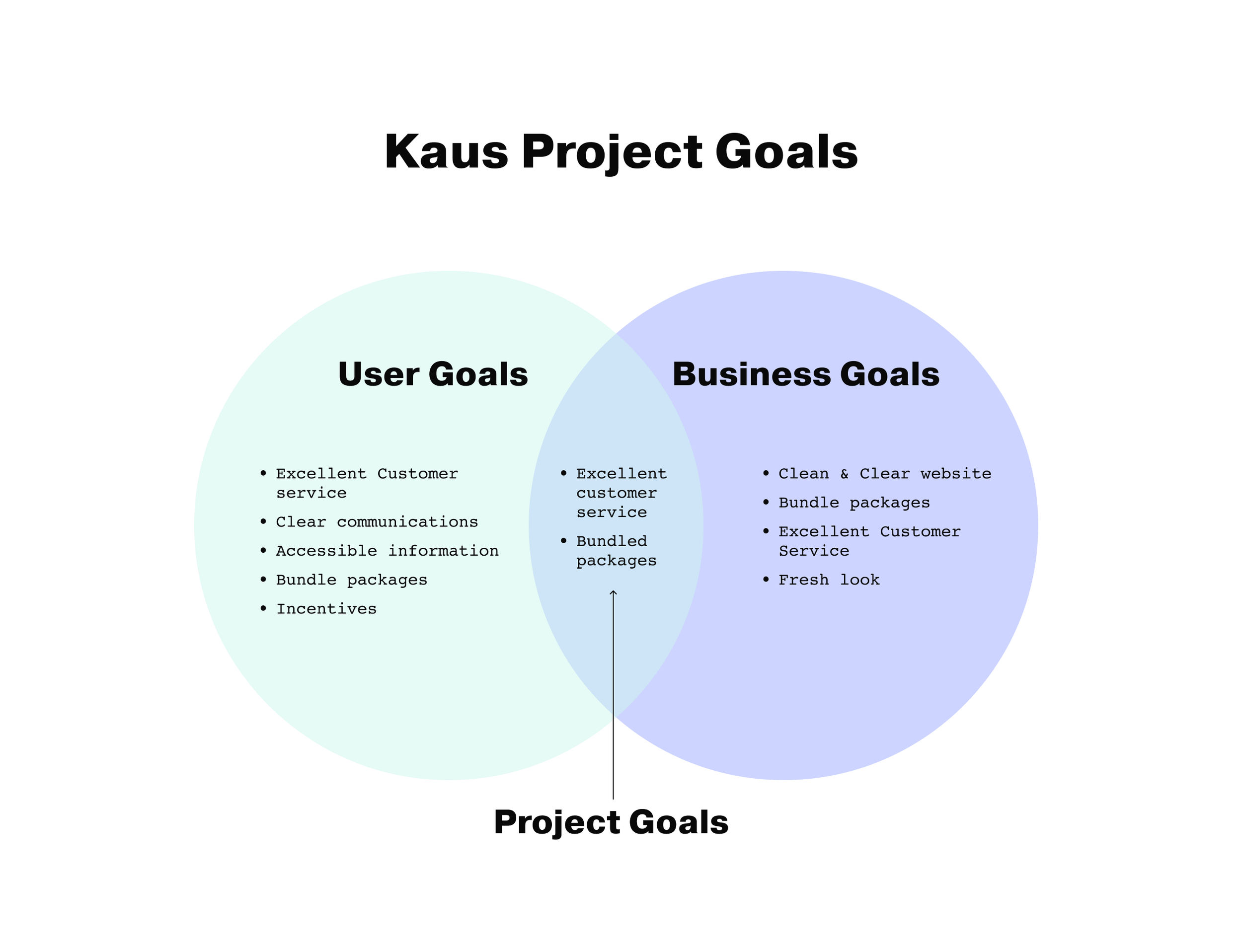
Design thinking has been created to always circle back. This step, the project goals Venn diagram, helped me hone in on where the project is going. The goals act as a guide to ensure that as the phases of the project move forward I stay on track.
The design brief tasks us to generate both structural and visual solutions within the confines of a responsive website. The diagram clearly states that both, the users and Kaus are looking for excellent customer service. Users and Kaus also align on the desire to have bundled packages.
As long as the design and prototype fulfill these two requests, both the user and Kaus will be happy.

Feature roadmap
It’s time to get organized.
The feature roadmap is the best way to move from the above goals to the logistical aspect of the project. Here I set out to rapid-fire all the possible attributes of the product. Additionally, it’s important to see where I got this information, such as competitor analysis, interviews, etc. The information can help me weigh out what becomes a priority or not.
From navigation items to projected possibilities of the product, this chart takes all those ideas, hopes, and dreams and breaks them down into four categories in this case. Our priority items are all elements that we have to have, like navigation. By prioritizing the elements not only can I build out the back end of the project, and the timeline, but I can ensure I have all the elements I need, want, and hope to have in the future.

Ideate
A building needs a floor plan before it’s built. That’s what I consider this phase of the project to be. This step builds a sturdy foundation for the rest of the project to build off of.
In this Section
Card Sorting
Sitemap
Task Flow
User Flow
Low-Fidelity Wireframes
Responsive Wireframes
Card Sorting
I used the Optimal Workshop program to create and organize my card-sorting exercise. I collected feedback from 4 different users and had them sort 20 cards into a hybrid categorization. Offering four varying categories, and allowing my participants to create their own categories if they deemed it more appropriate for the card gave me insight into the user’s thinking.

Similarity Matrix

Dendogram


Task Flow
I added a portion of my persona to the side of my task flow as a reminder that the task flow requirements are to hit the needs and motivations of my persona. Moriah, my user persona, was looking to work with an insurance company that provides excellent customer service. She wasn’t confident about making big decisions with her insurance. She also wanted to be sure she could bundle her insurance needs to get the best quote possible.


User Flow
When creating the user flow I used progress categories in light blue following a horizontal path to ensure each portion of the flow is in the correct progression from the starting point, through to completing the insurance setup and downloading temporary policyholder cards.
-
One of my biggest challenges when creating Task and User flows has been my inability to reverse my design thinking. Coming from graphic design I’m so accustomed to the design leading first. I am also a visual learner and thinker. So, doing flows requires my brain to think very hard about what the steps are without seeing them.


Responsive
Lo-fi Wireframes
It was exciting to see the product start to come to life, but there was one last critical step. I needed to be sure I created my lo-fi wireframes for tablets and mobile as well as desktops.
Using cards to contain the information ensured my breakpoints made a smooth transition so as to not disrupt the flow for the user.

Lo-fi Wireframes
I built my lo-fi wireframes with paper and pencil, starting with the desktop version. To be sure I had all the components I needed I clearly labeled each element. I then digitized my sketch.
A responsive design is critical to meeting the design brief, knowing that I designed sections that were comprised of cards that would easily transform based on the device. This proved to be a very efficient way of organizing the content.

Prototype
This is where the project comes to life. It’s the most exciting phase because it’s where research and design meet. Facts and imagination live together to make a product become a reality.
In this Section
Branding
UI Kit
High-Fidelity Wireframes
High-Fidelity Prototype

Mood Board
When collecting images for my mood board I was very intentional about taping into the 5 senses to guide me. While some of the senses didn’t apply, sight, touch, and smell all led me to think of fresh, clean, and healthy.
I added images of interior spaces because I thought it was important to think about this product as an office that a user walks into. I wanted to depict the vibe I wanted my users to feel, which was trust and mental health.
Fresh colors such as blues and purples felt young and vibrant. The iconography should look youthful but solid because insurance is a real adult decision, but it doesn’t have to look utilitarian and stuffy. A clean San serif typeface seemed fresh, but also accessible to all users.


Logo Exploration
I always start my logo design process with paper and pencil. I get all the wacky ideas out and then expand on the few that are the most applicable. I digitized and kept tweaking until the final version formed.
This logo is inspired by my user interviews. A user said going through the research and purchasing of insurance is the worst thing, but a necessary evil. I reversed this notion and came up with the tagline “Insurance that will make you smile.” The logo is based on a smile.
When it comes to color I work in black and white first. My design education taught me that if it can’t hold in black and white, then it can’t hold in color. As I added the colors from my mood board they jived together to make it feel good and fresh. I also pictured each color representing a type of insurance sold at Kaus. the use of yellow is known to invoke happiness, so yellow it was, and it worked.

UI Kit
The UI kit came together in combination with my mood board and logo branding design. The elements would be added in various ways to the hi-fi wireframe.


Hi-fi wireframes
Below are the homepages for the desktop and mobile versions. My first full version of the prototype was intentionally built out for mobile devices. Knowing that the design brief explicitly said bringing in a younger demographic is important to the new Kaus business model and based on my research, I knew that mobile and tablet devices are more commonly used than desktop.
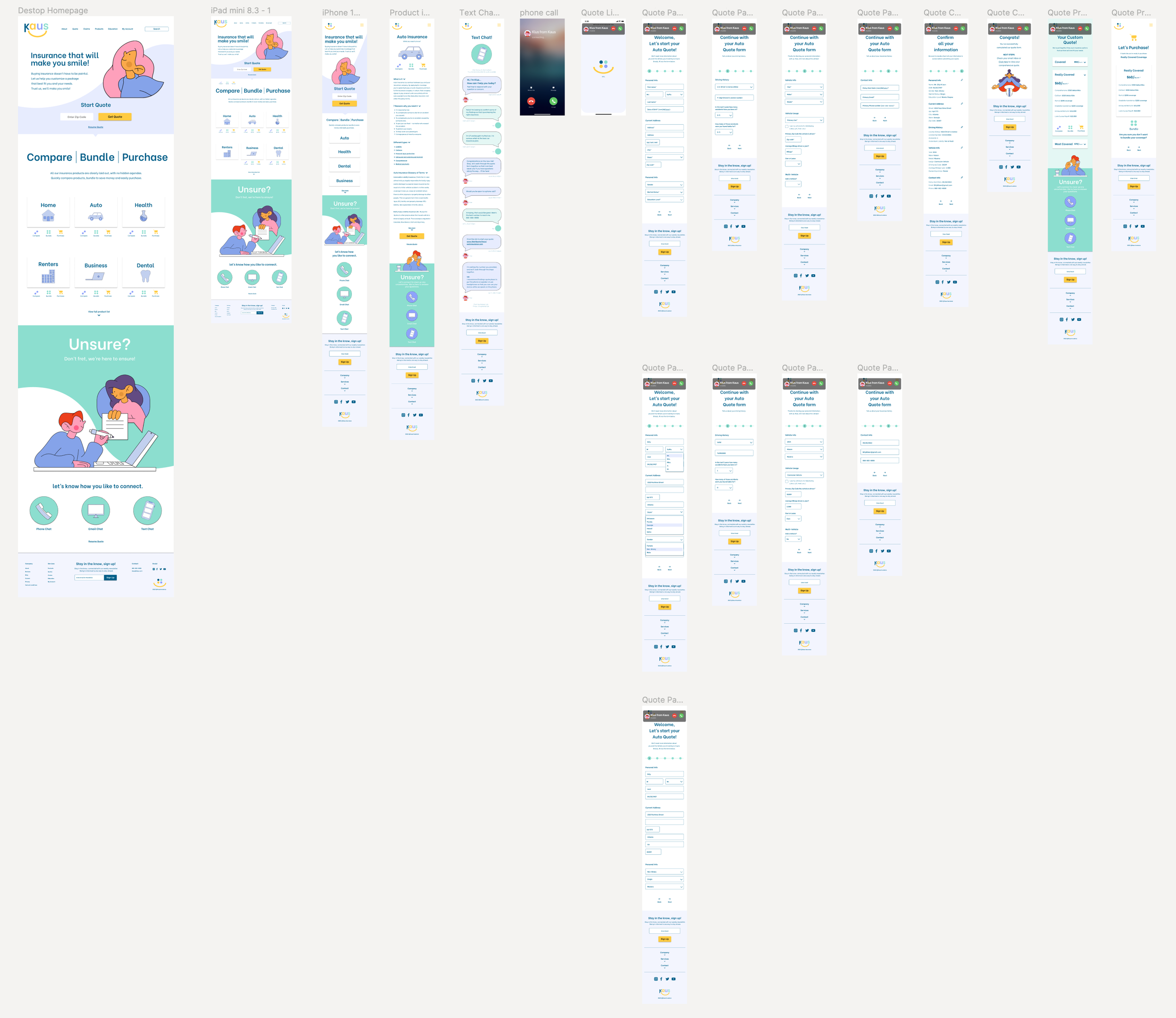
The Prototype version 1

-
Learning curve
This case study was the first time creating a prototype in Figma. Here is a list of some of the fails and wins:
Fails
-Lack of understanding around interactions/animations-Not creating the appropriate screens to mock all interaction states.
-Forgetting to link screens
Wins
-Asking for help in group crits
-Being resourceful, researching how to make a prototype in Figma.
-Designing a clean enough prototype to accomplish a usability test and get real-time results.

test
Testing 1, 2, 3 - Testing 1, 2, 3
In this Section
User Testing
Affinity Mapping
Priority Revisions
Usability Testing notes
Interview Style
1:1 Interviews conducted via in-persons, phone, or Facetime.
Participants
29-years-old // Designer // Single
35-years-old // Nurse // Single
41-years-old // Supply Chain // Single
65-years-old // Retired // Married
70-years-old // AirBnB Host // Married
Interview Quantitative results
Question 1:
How would you rate your experience learning about auto insurance and asking for help? (1=terrible to 10=absolutely)
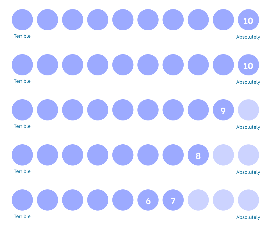
Question 2:
Rate our customer service experience.(1=terrible to 10=absolutely)

Interview Insights
Customer service helps the user feel more confident in their purchase of insurance
The look and design help make purchasing insurance more appealing
Being able to speak with a real human is important to most users
Having a clean, uncomplicated design puts the user at ease
Having loads of information readily accessible makes the user feel supported
opportunities
Details about how Kaus auto insurance is different than others
Discounts and savings should be clear
More FAQ info is available
Call UI is distracting
Headers could be shortened to pull all info up
The back and Next buttons don’t look like buttons
More information about Kaus as a company
Details about how Kaus auto insurance is different than others
Bundling information more accessible
Discounts and savings should be clear
Multiple call times during the chat interaction so the user doesn’t feel they have to take the call right away

Affinity Map
The affinity map is organized into three categories; design, UI, and content. These were the three categories that laid the foundation of my interview questions.
I made an executive decision to add the comments from a group critique after they reviewed my usability test prototype. I then added a sticky note color where the interview responses and the group critique responses were unanimous. The feedback was sound and shaped my next phase, priority revisions.
Priority Revisions
Less distracting call UI. This call section was overlapping the logo at the top, prohibiting users from clicking on the top navigation.


Call UI
A larger more visible next button was designed to swap out the small previous navigation. I want the design to stay trustworthy to users. The buttons were small and hard to see leading to distrust and trapped feelings. Lastly, the new button design guides users through the checkout process clearly.

The Next Button

Users mentioned that the ending of the collecting personal information section interaction felt unfinished. I added a confirmation screen that highlights all the users’ imputed info. They can edit the info if they see a mistake. Lastly, I added a confirmation of information screen. So users know they are done with their information and are ready for the next step.


Additional screens
The current purchase screen looked unattended too. Users wanted more excitement around purchasing. I brought in the yellow evoking the happy feelings and compiled the information in a more appealing way. Additionally, the revised discounts section looks more inviting.
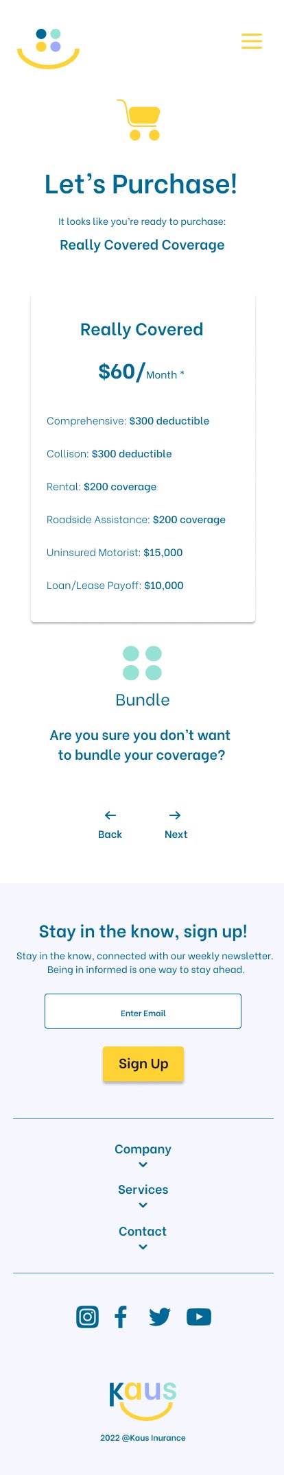
Re-designed Layout
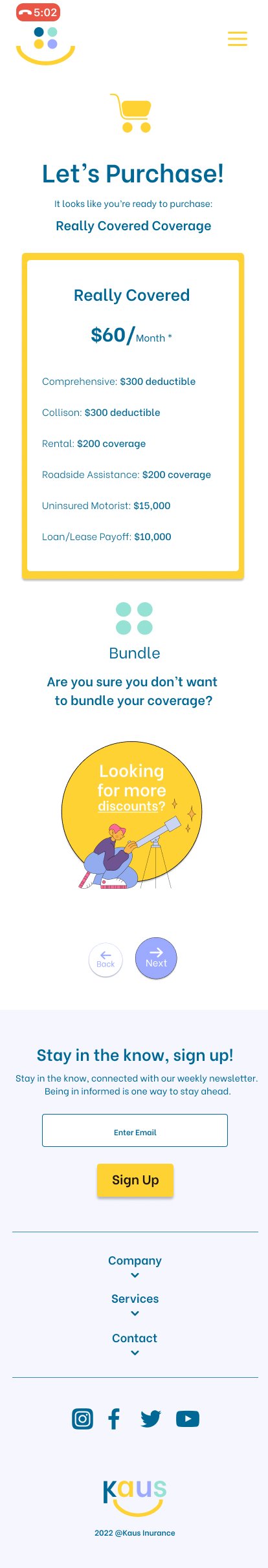

Shortened headers
My headers were a bit lengthy. Users said it felt clumsy to read and took up too much space.

-
Learning to love feedback.
Previously, in my graphic design career, I loathed feedback because it often felt more accusatory and senseless, and completely random rather than helpful and intentional.
One thing I’ve loved learning is how soliciting critical feedback can change your designs from okay to something great. Often times leading to a more successful project.
