
Phoenix Farm
case study no.3

Project overview
Project type: UX/UI, Responsive design
Case study timing: 5 weeks
Role: UX/UI Designer, Researcher
Tools: FIGMA, Optimal Workshop, Airtable
About: Phoenix Farm BnB, a charming Vermont countryside retreat sought to establish its own exclusive online platform. Their primary objective was to maintain full control over their revenue, rather than relying on external platforms like Airbnb. In addition, they aimed to create a delightful user experience that would leave a lasting impression on visitors, ultimately encouraging them to return for future bookings.
Relevance: By allowing BnB owners to create their own website and brand identity, we can help preserve the quaintness of small BnB locations.
Visitors will be able to learn about the history and character of each location and will have a more authentic experience compared to staying at a generic, cookie-cutter chain hotel. In addition, BnB owners will have the freedom to showcase the unique features of their property, such as a beautiful garden, gorgeous views, or vintage furnishings.

Quick Links

the Design Breif
Problem
It's no secret that the travel industry has rapidly changed in recent years with the rise of large corporations entering the hospitality market, such as Airbnb. With their deep pockets and advanced marketing strategies, these corporations have been able to edge out smaller, traditional bed-and-breakfast (BnB) establishments that once thrived in the market.
Unfortunately, with their rise to power, the whole experience of a traditional, authentic BnB is slowly disappearing, making the travel market monochromatic and offering nothing for users with a moral code looking to support local establishments.
Project Goal
The goal is to help these little BnBs, such as Phoenix Farm take their voice back by designing a responsive website that will be user-friendly and easy to navigate to book a stay.
It will include features such as a photo gallery of the facilities, descriptions of the rooms and amenities, and an online booking platform built directly into the website. This feature will allow Phoenix Farm to manage its reservations independently, without relying on third-party platforms such as AirBnB. By doing so, they can keep 100% of their earnings and enjoy full control over their calendar.
Project plan
Most importantly, the site will offer features that attract customers for the total lifecycle of the process, before, during, and after the user’s stay. By offering features that positively impact the user during these three pivotal interactions the hope is to generate enough buzz around the curated experience that it becomes its’ own marketing funnel that can compete with the larger corporations.

Empathize
Who is the user? What do they need and want?
In this Section
Competitive Analysis
User Interviews
User Persona
Research Key findings
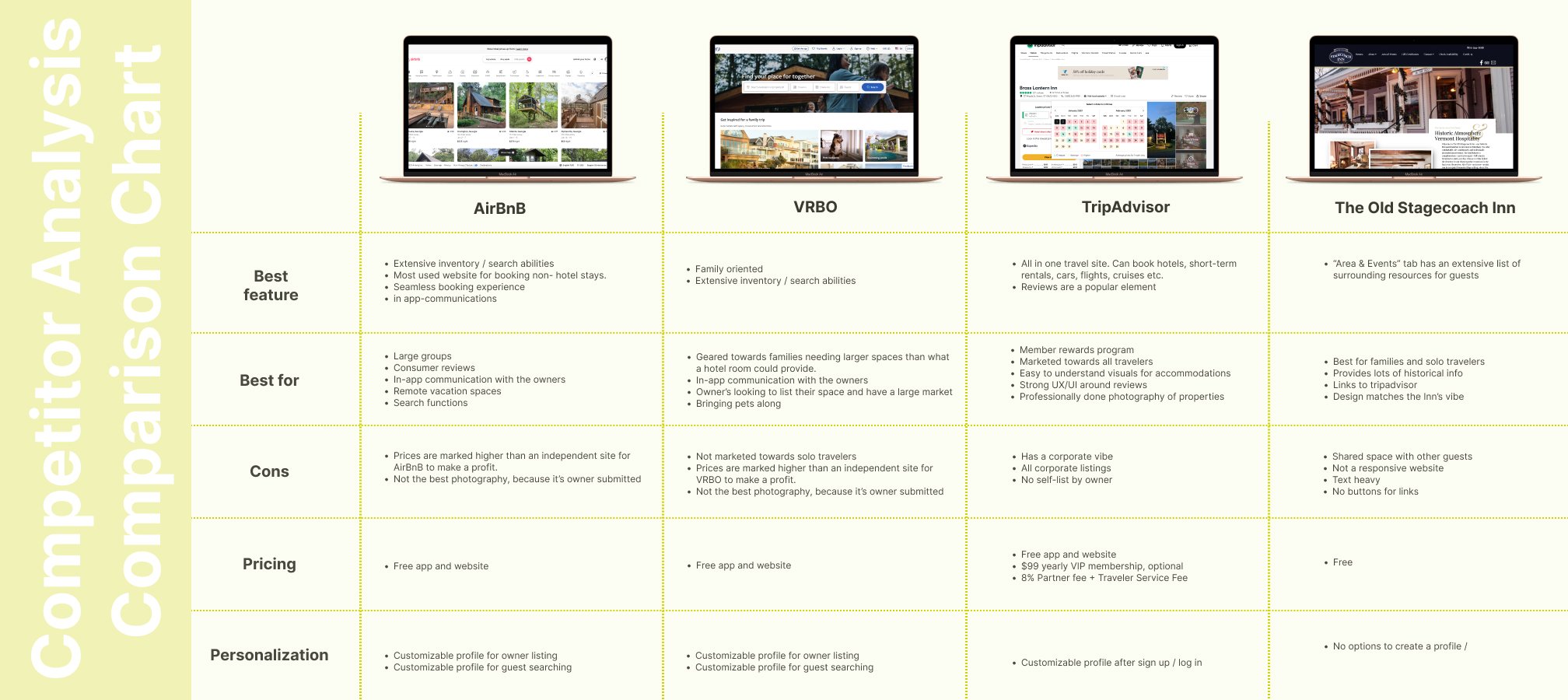
competitive Analysis
I believe there are plenty of users out there who would prefer to book their travels through independent BnB sites because they believe the same, larger corporations are sucking the life out of authentic travel destinations. However, I knew the hunt for the ideal user would be tricky because the convenience of these larger establishments is hard to beat. So my curiosity led to conducting a competitor analysis chart. My thinking was to cast the net large, then funnel it down through more research data points until the ideal user becomes obvious.
insight
It seemed like the obvious competitors were the large corporations, but really the ideal user wouldn’t want to support them, hence the desire to find an authentic experience. I added a small BnB at the end to understand the difference between their offerings and the larger corporations, and it was a totally curated experience. You get the look and feel of the BnB site over cookie-cutter sites like AirBnB. It was important to compare them because what was clear is that the larger site had better booking flows but the smaller BnB had a better overall authentic experience.
-
Learning Mistakes.
While Bob Ross would fully disagree, learning from our mistakes isn’t prized much in our society. The majority of employers value those who don’t make mistakes.
Well, I made a mistake while building out the first portion of my research, and here’s what I learned.
The mistake: I built out a comparison chart with three larger corporations and one independent BnB site. When what I should’ve done was just the opposite. I gathered more information on the things that I didn’t want to build and less information on the things that I wanted to build.
What I learned: My data felt skewed in the wrong direction but I learned it worked in my favor because the contrast was glaringly obvious and proved the very point of the case study. The large corporations are boring and soulless, whereas small BnBs have character, class, and sass making them unique and desirable. They just lacked some of the bells and whistles that make them more user-friendly, which is where I found my niche.


Research plan
+ Interviews
My research plan document and interview questions document took me three tries to hone in on the goals and specifically craft the right questions to get the answers to the problem. My mentor pushed me to think of questions to help me understand:
What works well with the sites they currently use?
What are the key decision-making factors? Reviews? Star Rating?
Difference between booking directly with a B&B versus using an aggregator.
Questions that will help you get responses on Needs, Motivations, Wants, and Pain Points.
4 takeaways
Below are four quick takeaways from my four 1:1 user interviews.
These interviews were conducted via FaceTime or Zoom.
100% of participants mentioned Airbnb as their top three go-to travel sites.
It was mentioned that after COVID-19, users wanted their own space and control their environment.

3 out of 4 participants had booked through an independent site, but in another country, not the US.
2 out of 4 participants traveled for work and stayed at a hotel but for personal stays would prefer to book an Airbnb.

100% of participants said they make travel decisions based on ratings and reviews.
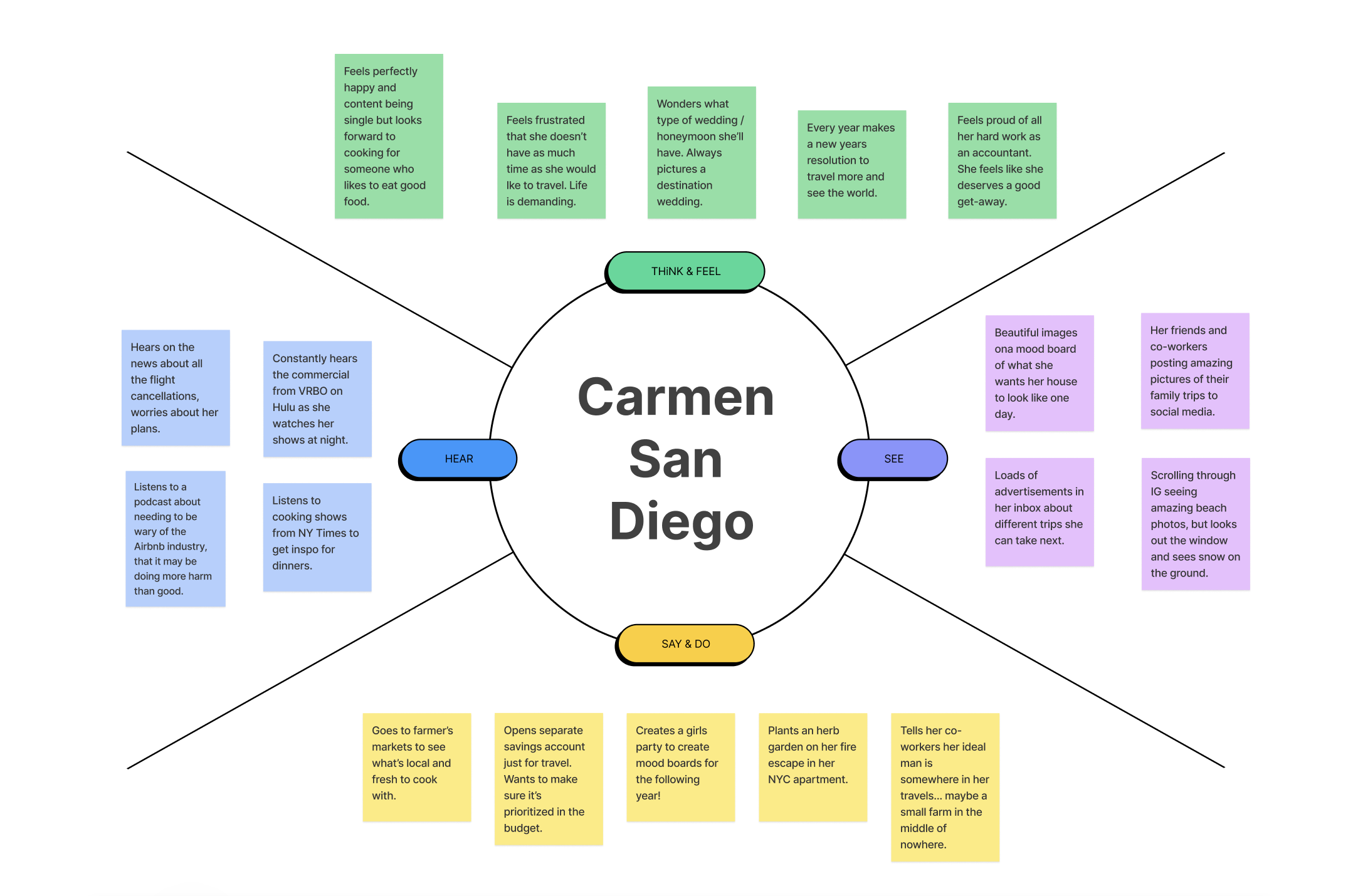
Empathy Map
This empathy map shows Carmen’s personality in the wild. What she would see, say, hear, think, and feel. The empathy map is a way to step inside the user’s shoes and see the world from their perspective. This phase in the project is one of my favorites to create. I enjoy how it immediately validates the heartbeat of the whole project and it triggers a strong feeling of needing to solve this problem for my users. It gives me empathy. wink wink.
-
Empathy Maps.
These are my favorites to create. One of my core CliftonStrengths is being a relator. This means relationship building.
“People exceptionally talented in the Relator theme enjoy close relationships with others. They find deep satisfaction in working hard with friends to achieve a goal” — Gallup

User persona
Carmen is my ideal user. Her persona clearly states her behavior, goals, needs, pains, and motivations. After conducting my user interviews, it was clear the direction the data was taking me. This persona is a great combination of my competitor analysis and my user interviews.
Research Key Findings
Competitor Analysis
What my competitor analysis has provided for this project is the understanding of the stark contrast between the offerings of a large corporation, such as Airbnb, in comparison to the authentic experience an independent BnB site offers users. Let’s review the main pros and cons for each:
Large Corps (AirBnB, VRBO, etc.)
Pros
- User-friendly booking flow
- Advanced marketing algorithms
- Multiple listing options
- Free for users
- Mobile-friendly site
Cons
- Fees applied to sellers (BnB owners)
- Website has a homogeneous look and feel
- Undermines local/small businesses
- No unique design per listing
- Intense competition on the platform

Independent BnBs (Owner owned)
Pros
- Authentic branding user experience
- Seamless digital to an in-person experience
- Free for users
- Owner retains all profits
Cons
- Less marketing power
- Poor booking flow
- Linked to large corp, like TripAdvisor
- Potentially lower budget design
- Potentially not as user-friendly
- Potentially no mobile-friendly site
User Interviews
The information I learned from my user interviews validated and filled holes that my competitor analysis missed. With boots-on-the-ground learning and a set of intentionally designed questions, I was able to confirm my ideal user and their needs, motivations, and pain points around the divide in the travel market.
Let’s review the key takeaways from my user interviews:
100% of participants mentioned Airbnb as their top three go-to travel sites.

3 out of 4 participants mentioned trust or feelings relating to trust as a factor when asked to explain why they don’t regularly book through an independent site.
3 out of 4 participants had booked through an independent site, but in another country, not the US.
2 out of 4 participants traveled for work and stay at a hotel but for personal stays would prefer to book an Airbnb.
100% of participants said they make travel decisions based on ratings and reviews.
The Niche:
Problem validation

Verification to move forward
Now that our research is done and we’ve synthesized all the data, it’s important to verify the totality of the problem.
This funnel shows that I have identified the areas of weakness or opportunity in the market. I have queried users directly to ask what they need, want, and struggle with currently. Lastly, I have created a persona, based on an empathy map and the above data that will act as the ideal user for this product build. I can generate a mission statement that clearly articulates the problem we need to solve.
2 Part Problem:
What is a product solution that bridges the gap from what a larger corporation can offer in terms of structural usability, but has the morals and values of an authentic independent BnB that focuses on local businesses and collaboration?
I’m asking how can a travel website meet the needed demand of top marketing influence without being a large corporation, while ensuring independent BnB owners retain 100% of their profit.
-
Show your work.
It’s important to me that you understand how my brain works. I’m going to describe to you the process of deciding on a funnel diagram as the best method to present this research wrap-up.
Visual thinker. I laid on the floor and stared at the ceiling to see it all in my imaginary artboard.
Recall. all the times I had to create infographics for my previous design work, it’s all information architecture.
Mind sift. Cycled through three different diagrams in my head, Venn Diagram, Flow Chart, and Funnel Diagram.
Logic. The research phase is a process-based actuation. I synthesised a wide range of information, like the competitor analysis chart, down to a singular plan of action moving forward, feature packed responsive website, the funnel seemed the most logical.
Create. Once I could see it in my head, I then decided what method would work best for the presentation. I thought Wall and Paper would be cool, but an image wouldn’t translate well on the website. So I went digital so that I could have a .gif file and link to review the final.

Define
A ray of sun and a splash of water, then watch it grow and grow.
In this Section
Project Goals
Feature Roadmap

Project Goals
In the last section, I researched and collected data from the travel market and directly from users. After my analysis, I was confident that our problem was clearly stated and ready to continue with our MVP and then conduct a usability test. Here I’ve mapped out some solutions to our 2-part problem from above. I have used this as my project definition doc.
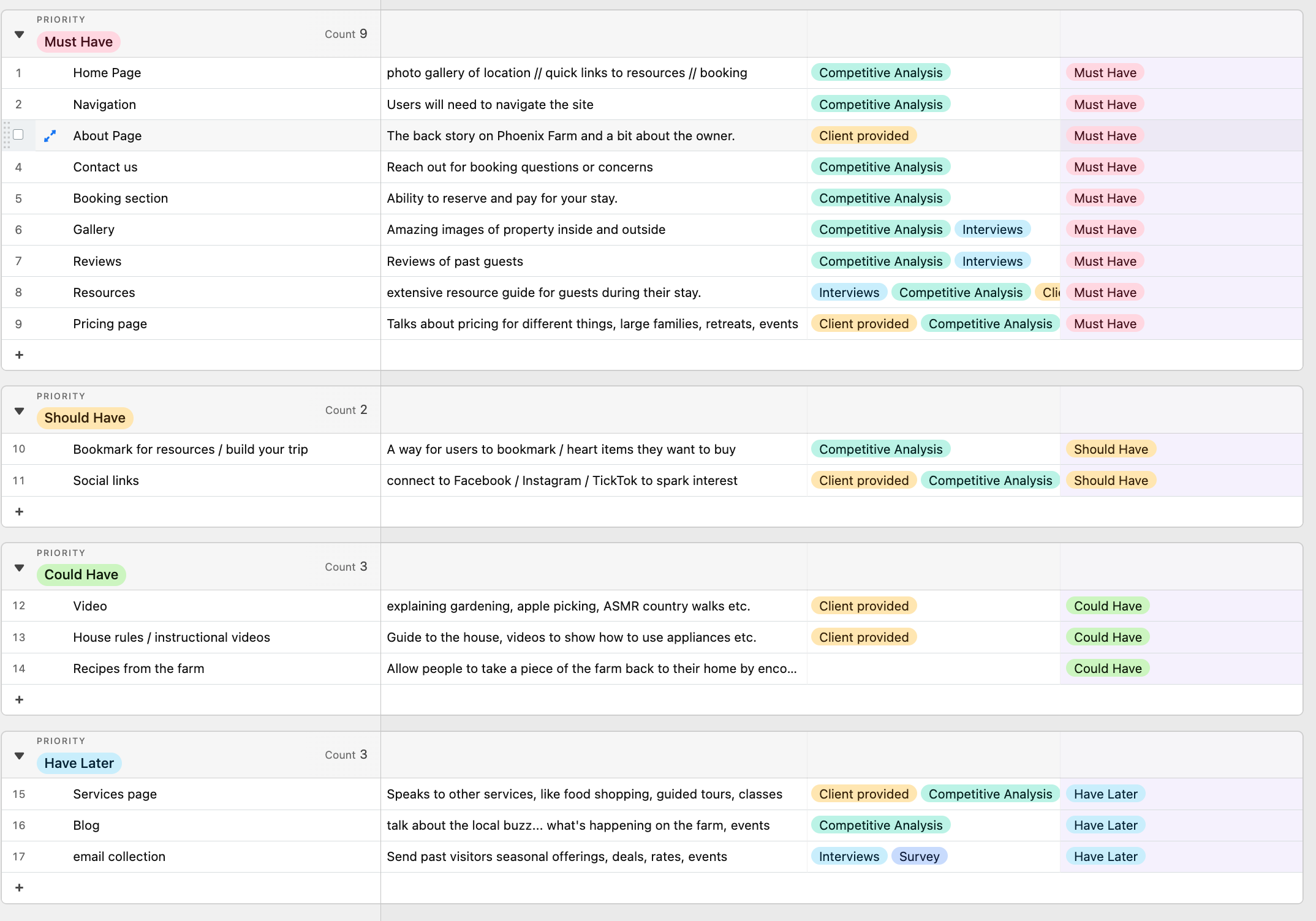
Feature Roadmap
To accomplish a feature-packed responsive website I had to use forward thinking to imagine all the site could be. This became my “Have later” Category. I then worked backward to ensure I covered all the possible features I would need to offer elements on the website that would accommodate my users, before, during, and after their stay. View Airtable file.

Ideate
A project comes to life, like a flame dancing in a fireplace.
In this Section
Card Sorting
Sitemap
Task & User Flow
Low-Fidelity Wireframes

Card Sorting
The first step to making this product come to life was conducting a card-sorting exercise. This was a great way to see what users are accustomed to when it comes to website navigation. This shows what the standard practices are, but also what users may want to change by giving them the ability to create their own categories. As you can see here my users didn’t make any new trends with the navigation and they used standard practices for the placement of elements in the navigation.

Site Map
My site map is more exact because of my card-sorting exercise. My navigation is clean and organized in a predictable way lending itself to a high usability score.

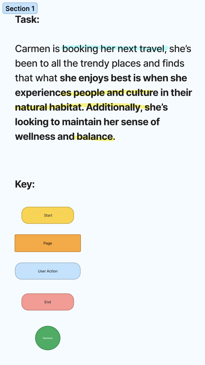
Task Flow
The task flow follows a user’s journey, in this case, Carmen, the project persona. She explores the site to see what features engage her and then proceeds through the booking process. I’ve included a paragraph explaining the user’s intentions along with a key.

User Flow
When creating this user flow I frequently checked in with my persona, Carmen, to ensure the decisions being made were in alignment with the ethics and moral code she would’ve had. We first see this instance when the user approaches the “Resource Page.” It’s a make-or-break point in the flow because the user first sees alignment with the product, and continues forward.

Lo-Fi Wireframes
The lo-fi wireframes consist of cards and modules to build out the responsive website. I’ve found this is the best way to quickly and effectively ensure all breakpoints are pleasing to the eye and don’t interfere with the usability of the product.
-
Growth.
I believe it’s important to take stock of your own growth. When I set out to improve my skills as a designer and make the career switch to UX design I had never built wireframes at all. After three projects I can see my growth.
When building the lo-fi wireframes for this project not only did I quickly get them finished, but they are the closest to what the final prototype looks like. This means I was easily building on the lo-fi wireframes, instead of reworking or remaking them as I had in past projects.
It’s exciting.

Prototype
Facilitation (i.e., the ability to use emotions to guide our cognition).
In this Section
Branding
Moodboard
UI Kit
High-Fidelity Wireframes
High-Fidelity Prototype

Branding
Phoenix Farm had an existing logo and branding. I tweaked the logo a bit to incorporate the organic feel of the project. By using this deep moss green color it brings that idea of Farmer’s Market chic into play. I didn’t like how stark the white knockout felt, so I changed it to a soft tan. Lastly, I added a rounded edge to the rectangular logo shape making it appear more like an app icon.

Mood board
The inspiration behind my mood board came from both the existing branding of Phoenix Farm, and the imagery of the interior and exterior space as well as thinking about what my ideal persona would like on Instagram and Pinterest.
Color: Earthy color palette, thinking farmers market and brown paper bags. Pops of vibrant green like you would see in nature, like a new leaf.
Imagery: Quaint illustrations with a hand-drawn feel. Something that would be sold on Etsy.
Typeface: Used the existing logo typeface for all the headers and then paired it with a user-friendly san serf for all secondary text.
-
Mood boarding.
This is probably one of my favorite activities both professionally and personally. It all started back in grade school with scissors and glue.
I find it to be a fun brain exercise of matching visuals to my thoughts, feelings, hopes, and dreams. A mood board is a place where possibilities come to life. It’s the looking glass into the future.
When it comes to mood boarding for a project it reinvigorates my enthusiasm for what I’m working on.

UI Kit
Based on my moodboard these elements came together to generate my UI kit, hi-fi wireframes, and prototype.

hi-Fi Wireframes
The hi-fi wireframes were quick and easy to produce when it came to the layout as I had built a strong foundation with my lo-fi wireframes. The hardest element was copy-editing placeholder text for each section. Lastly, I added a few more pages to ensure the flow was seamless for the users.
Homepage Hero swap
As previously mentioned above, I swapped the homepage hero section from the gallery to the booking flow. The reason I did this was to prioritize the booking flow, which was seemingly getting lost. I know from my research that users deem imagery to be very important on a travel site, however adding the booking flow at the top eliminates a step for return users. See below for before and after.

Lo-Fi wireframe // Homepage Hero

Hi-Fi wireframe // Homepage Hero

hi-Fi Mobile Wireframes
I made a very simple lo-fi wireframe from the mobile version, but it was fun to see this come to life in the hi-fi version. I intentionally selected to create these screens as my research would prove that they are the most important for my user interaction on a mobile device.


hi-Fi Prototype
The hi-fi prototype takes the user through a desktop v simple exploration of the resource pages and then through the booking flow.

Test
If a tree fell in the forest would it make noise a if nobody was around to hear it?
In this Section
User Testing
Affinity Mapping
Priority revisions
Usability Testing
The first step is to create the usability testing document that reveals the usability test plan. For this phase in the project I know it’s best that I do 1:1 interviews with users to get their direct feedback on the MVP. I’ve generated a list of questions that are broken down into three task-oriented sections for my user to accomplish.
-
Scenario:
You have heard about this location called Phoenix Farm when you drove past the area, imagine you are opening the site for the first time and start browsing
How easy was it to explore the Phoenix Farm site? - Not easy - indifferent - Very easy
Does the homepage have all the critical elements needed to answer your questions?
Were you able to understand the focus of the site when you first arrived?
What did you think when you first landed on the site?
On a scale of 1-10 (1 being very poor and 10 being very satisfactory), how would you rate the layout of the information? Explain your answer
On a scale of 1-10 (1 being very poor and 10 being very satisfactory), how would you rate the look and feel? Explain your answer
-
Scenario:
Now that you’ve explored the site, you decided to book your stay and you’ve just arrived at Phoenix Farm to enjoy your weekend getaway and its dinner time. Even though you brought some food items you want to explore the local restaurants, so you hop back on the site to look.
On a scale of 1-10 (1 being very poor and 10 being very satisfactory), how would you rate the booking experience? Explain your answer
How likely are you to use the provided links on the last page of the booking process? - Not very likely - likely - Very likely
How likely are you to use the Phoenix Farm website during your stay at Phoenix Farm?- Not very likely - likely - Very likely
What elements of the site are the most useful to you during your stay?
What did you notice on the resources page that was helpful?
What did you notice on the resources page that was not helpful?
-
Scenario:
You had a wonderful getaway weekend at Phoenix Farm, you're a little sad to be back home. It’s dinner time and you’re craving the foods you ate back at Phoenix Farm.
How likely are you to use the Phoenix Farm website after your stay?- Not very likely - likely - Very likely
What are the pages on the site you would visit most after your stay?
What elements of the pages you selected would be the most useful to you?
What pages on the site would you be most excited to share with your friends and family?
How likely are you to use the Phoenix Farm website to rebook a stay?- Not very likely - likely - Very likely
-
I find I can be impatient about starting new projects. I bull right in and lose focus. So let’s pause, take a breath, and review with some questions:
What is the project?
What are the goals?
What do we think is the best solution at this time?
How do we get there?
see in this section how I clarify these questions.
Lastly, using a blank wall and sticky notes allows me to organize my thoughts quickly.
Test Participants and responses
Participant 1
Age: 28
Gender: Female
Profession: Graphic Designer / UX Designer

Participant 2
Age: 32
Gender: Male
Profession: Marketing Manager

Participant 3
Age: 42
Gender: Male
Profession: Supply Chain Management

Participant 4
Age: 30
Gender: Female
Profession: AppleCare Tech at Apple

Quantitative Participant Responses
-
Q1: How easy was it to explore the Phoenix Farm site?
- Not easy
- indifferent
- Very easyScore: 4/4 Very Easy to explore
P1: Very easy. It’s very clear what the user should be doing and focused on. The design is clean and simple which helps make exploration simple.
P2: Very easy. Seemed really straightforward, from what I can access.
P3: Very easy. I like this a lot. It’s so organic and farm-like.
P4: Very easy. I had no trouble at all
—
Q2: On a scale of 1-10 (1 being very poor and 10 being very satisfactory), how would you rate the layout of the information?
Score: 3/4 10 Very satisfactory layouts of information
P1: 10. I think the information is in the right place. It’s easy to find but not cluttering the space.
P2: 8.5. I think it looked clear enough
P3: 10. The layout is super clear.
P4: 10
—
Q3: On a scale of 1-10 (1 being very poor and 10 being very satisfactory), how would you rate the look and feel?
Score: 3/4 10 Very satisfactory look and feel
P1: 10 . Again, the design is what I would imagine a place to actually be inside, or from what I can see in the photos. I really enjoy the color palette and the little illustrations the most.
P2: 9. It’s not my vibe, but I think it matches what the brand is.
P3: 10. I love it! I think it’s adorable.
P4: 10. I had never been to Vermont, so it made me want to see how this compares to the real thing.
-
Q1: On a scale of 1-10 (1 being very poor and 10 being very satisfactory), how would you rate the booking experience? Explain your answer
Score: 3/4 - 10 Very satisfactory booking experience
P1: 8. I think it’s super simple. I do think there needs to be larger text in some places. It seems like this is where you want to be super transparent and not falsely hide information because it is too small.
P2: 10. It seemed just like how AirBnb does its baking process. Seemed really simple.
P3: 10. It’s super clear. The steps are laid out for you, it seemed like I could have a place booked within minutes.
P4: 10. It was really simple and had the information needed. Age groups being targeted will be important to identify because you might want more things.
—
Q2: How likely are you to use the provided links on the last page of the booking process?
Score: 3/4 - Likely or very likely - To use the links on the last page of the booking process
P1: Likely. I tend to just get the job done and once I’ve booked I’m off to the next thing. But I do think that having those links there is good if people have never been to a place like Phoenix Farm.
P2: Not Very Likely. Once I finished the task of booking I felt I was ready to move on to the next thing. But I think a lot of people would read that stuff.
P3: Very likely. I think that is so smart, I totally would need help knowing what to pack. It’s a way of getting excited about your trip because you can go back and see all the seasonal things to do or even check out what restaurants you want to visit ahead of time.
P4: Very likely. It’s a friendly reminder to pack right or know certain things.
—
Q3: How likely are you to use the Phoenix Farm website during your stay at Phoenix Farm?
Score: 4/4 - Likely or very likely - To use the Phoenix Farm website during their stay
P1: Very Likely. I think that I would be using the resource section a bunch. To be able to move around like a local is really what I want to do when I travel anywhere but having all that information you kind of providing a cheat sheet. I think that the recipe section is very clever as well. I don’t cook much but I would bring someone who did.
P2: Likely. I would definitely want to see what to do or where to eat.
P3: Very likely. I would need to check the restaurant and bar list. I hope they have some good brewery tours!
P4: likely.
-
Q1: How likely are you to use the Phoenix Farm website after your stay?
score: 3/4 - Likely or very likely - To use the Phoenix Farm website after their stay
P1: Likely. I could see myself coming back to find a recipe or share it with a friend. I don’t cook but I would have someone make it.
P2: Not very likely. The only thing I could see being helpful would be the recipes that you could return to but I don’t think I would do that.
P3: Very likely. I would be all over those recipes!
P4: Very likely.
—
Q2: What are the pages on the site you would visit most after your stay?
Score: 3/4 - Resources page - would be the page they visit most after their stay
P1: Resources
P2: I wouldn’t really.
P3: Resources/recipes
P4: Recipes!
—
Q3: How likely are you to use the Phoenix Farm website to rebook a stay?
Score: 4/4 - Likely or very likely - To use the Phoenix Farm website to rebook a stay
P1: Likely. I tend to want to try new places but I think this would be interesting to see how things change in different seasons. The foods and activities would be totally different in summer versus winter. So that might be cool to see.
P2: Likely. I don’t usually rebook at places but sometimes it is nice. I would rather book on their own site than go with Airbnb.
P3: Very likely. I assume the stay would be just as great as the site!
P4: Very likely.

Affinity Map
I gathered all the data from the usability test and put together an affinity map to better organize the users’ comments. I start by categorizing sections where comments are best suited. This helps me to know where to focus my attention for making priority revisions. The category that has the most comments definitely needs to be prioritized.
Priority Revisions
The priority revisions were selected based on the results of my usability testing. The top four revisions were related to usability and accessibility which took precedence.

Revision 1: Less is more
Problem: Users stated that the small text in the resource cards was hard to read and distracting. They mentioned this text wouldn’t be read or be a part of the decision-making process of which resource card they would select.
Revision: I removed the text from all the resource cards, leaving the title, imagery, and down arrow UI to indicate more content within.

Revision 2: Buttons
Problem: Users noted that the button color was hard to see and didn’t provide enough contrast between button color and button text. This is a huge accessibility problem.
Revision: I swapped the yellow color to burnt orange to make the button pop more and to provide more contrast between the button color and the button text.

Revision 3: Text size
Problem: Users struggled to get through the booking flow. They mentioned the text size was hard to read because it was too small. They mentioned this led to a bit of anxiety around entering important personal and banking information.
Revision: I increased the text size of the booking flow by 4 points to ensure more legibility.

Revision 4: Photo Gallery UI
Problem: I left off the next and back button UI on the homepage. Users were unable to flip through the photo gallery. On the gallery page the buttons were there, but very hard to see. Users were struggling to find them.
Revision: I created visible next and back buttons, using burnt orange and a white knockout arrow. I placed this on both the homepage gallery and the gallery page section for consistency.
