Erotic Blueprint
case study no.4
Project overview
Project type: UX/UI, Branding, End-to-End Application
Case study timing: 6 weeks
Role: UX/UI Designer, Researcher
Tools: FIGMA, Airtable, Typeform, Pinterest
About: Somatic sexologist and educator Jaiya has created The Erotic Blueprint, an in-person and online workshop on how to get off! While her work made it to Netflix, I felt there was a larger opportunity to reach the masses and help us all understand sex and our own bodies more in-depth. This project re-designs Jaiya’s existing branding and places her work in a user-friendly application that can be used singularly or in tandem for the purposes of finding a mate through the lens of the Erotic Blueprint formula.
Relevance: Jaiya’s research to design The Erotic Blueprint, and create workshops for individuals and couples has changed the way we look at sex, ourselves as sexual beings, and what an honest sexual connection can look like. By continuing to educate society and remove shame and stigma we can live happier, healthier lives as sexual beings. This app takes this knowledge and shares it in a safe, informative, and connective way.

Quick Links
the Design brief
Problem
Task: Design an end-to-end application of my selection
My selection: My plan is to redesign, reformat, and build upon the work done by Jaiya, a sexologist and educator, who has spent the past twenty years studying what arouses people and developed The Erotic Blueprint.
About The Erotic Blueprint: The Erotic Blueprint is a guide to what brings about arousal in individuals, such as energy, sensuality, sexuality, kinkiness, or the ability to switch between preferences. She created a questionnaire that a person can fill out to see what their personal Erotic Blueprint is. Jaiya believes that understanding your Erotic Blueprint can lead to stronger connections with yourself and your partner(s), provide more fulfilling intimacy, and better sex.
To learn more about the Erotic Blueprint, you can watch the Netflix show called Sex, Love & Goop, which is a documentary series produced by Gwyneth Paltrow's company, The Goop Lab.
Interestingly, despite Jaiya's work being available on Netflix, 60% of the participants in my research study had never watched the episode and had no knowledge of the Erotic Blueprint. The issue lies in the fact that this valuable information should be widely known, but it is not easily accessible.
Project Goals
The goal is to uphold Jaiya’s work and strive for users to have a “deeper connection, fulfilling intimacy, and satisfying sex.” In my role, I aim to redesign Jaiya's work into an approachable end-to-end application for people to comprehend and access. I plan to include additional features that can enhance the exploration of sexual pleasure, whether alone or with a partner(s). More goals:
Informative about the Erotic Blueprint
Safe for all users
Potential healing space
Place of honesty
Possible Solutions
Re-design the current branding and design an end-to-end application for users that includes familiar features of current sex/dating apps. The foundation of the app is based on The Erotic Blueprint Breakthrough.
Let’s Hypothesize
-
Individuals
Couples ( of all sexual orientations )
Ages 18+
Those looking for more insight into their bodies
Those exploring their limits of sex
Those looking to reboot their relationship
Those needing to heal from sexual trauma
Those who are sexually liberated, but like structure
Those potentially looking for like-minded / or of a similar erotic blueprint
-
Personal Profile
Quiz
Subscription / unlock paid features
Journaling/note-taking
Charting/tracking
Partner discovery
Erotic gameplay
Partner feedback about sexual experiences
Courses
Chat
Matchmaking
Coaching
Directory of sex professionals
Blog
About Jaiya (the inventor of these methods)
-
Users haven’t seen the show/documentary
Too many features to build out
The idea isn’t helping to have an app form
Privacy concerns w/people’s information
Users not being honest about their own sex lives during research
People feel uncomfortable speaking about sex during interviews
-
Hypothesize.
Taking time to hypothesize what is or isn’t possible for the project can allow your brain to think without judgment. It allows for great ideas and concerns to equally take up space. It’s like throwing it all out there and then allowing your research to highlight or eliminate ideas with the facts and data.

Empathize
What is sex and why do we all look at it differently?
In this Section
Competitive analysis
User interviews
User persona
Research key findings
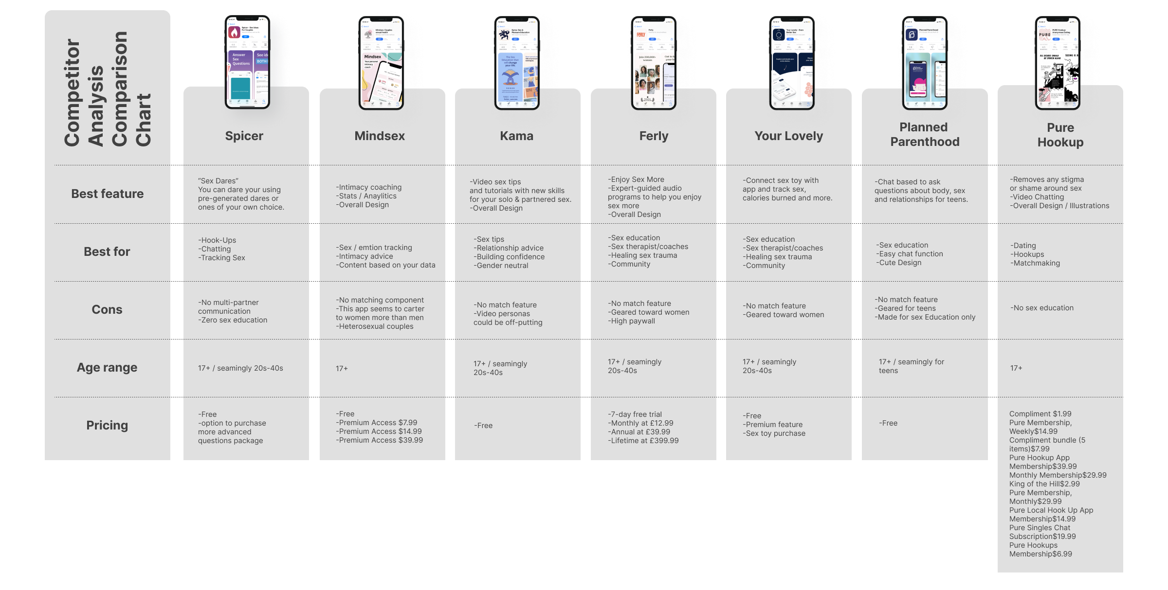
competitor
Analysis findings
Conducting research for this project was nothing but juicy. The market is saturated with apps about sex and intimacy. They range from sex education to algorithmic apps to find one-night stands. When it came to the market offerings, it seemed there was something for everyone.
While this could be a deterrent to this project, I was able to spin it and use it to my advantage. I compared the top apps in their niche market to see what they did well and what they lacked based on user ratings and reviews.
Research Strategy
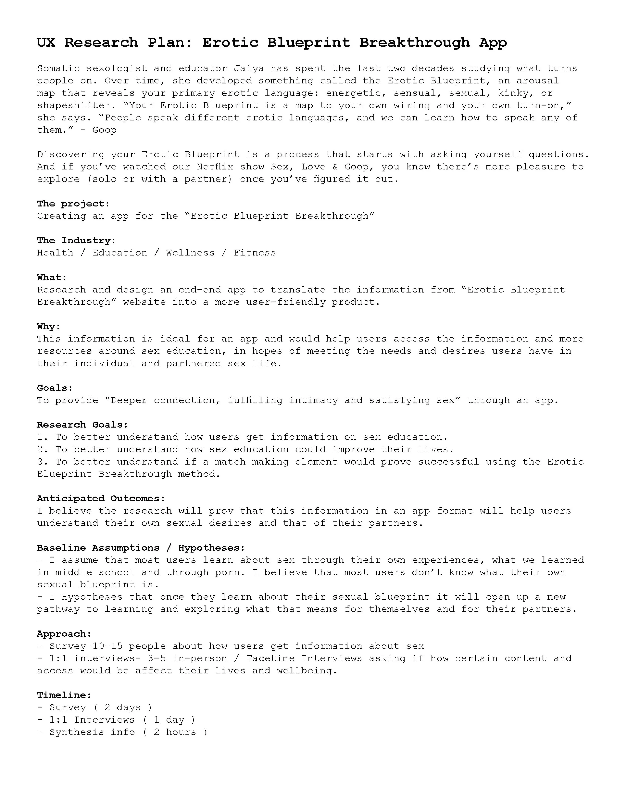
Research plan
Organization is the first step I take when starting the research phase of a project. The Research Plan Doc helps me to clearly state my intentions, goals, and initial theories about the project. This is the point at which I decide how to query users to gather the information needed.
For this project, I decided best to conduct a 2-part strategy, survey, and 1:1 user interviews.
Survey: The survey method seemed like an efficient way to gather data on a subject matter, sex, that was potentially uncomfortable or embarrassing to speak about truthfully.
1:1 Interviews: I thought the 1:1 User interview method would give me a view into the raw human reactions to sex. It would provide important information about safety, comfort zones, immediate preferences, etc.

Research Survey Questions
The survey questions primed the pump to get a better understanding of how people view sex, intimacy, and sex education. By understanding the landscape a bit more, I was able to tailor my interview questions and gather a more in-depth read on the user’s needs, motivations, pain points, and of course what works.
While sexual orientation or preference doesn’t matter from a judgemental standpoint, it was important to understand how users identify as a way to create the most inclusive experience possible.
Research User interview questions
The 1:1 interview questions are always a bit tricky. It requires understanding the project and asking the right questions to help lead the project forward. A part of this interview was about understanding what users knew about Jaiya’s work, The Erotic Blueprint Breakthrough. Additionally, I wanted to know if the principles of The Erotic Blueprint would be useful to users understanding of their own sexual desires and that of their partner(s).
-
Research Methods.
Up until this point, I had been following the same research plan for each project. I would do my initial competitor analysis, followed by user interviews, and it works fine.
However, by adding one more research method to this project, I gained a tremendous amount more insight, and another data set to compare user feedback with.
Not only did I find the survey method helpful, but it was very efficient. I constructed the survey in Typeform, posted it to my IG bio and while I was conducting my user 1:1 user interviews my survey responses were rolling in!
Research Findings
Typeform Survey + Responses
Typeform provides a few different viewing options for the results, as well as a downloadable document. Survey results doc


3 Important facts

1. These results confirm that a wide range of sexual orientations /preferences exists.
I specifically asked about sexual orientation and preference to avoid building an app based on assumptions, thus not being safe or inclusive to all, which is the goal.

2. This graph shows that most of my participants learn from their own experiences.
Asking about how users seek their information about sex was important. It could lead to an area of opportunity, or further research on why these responses exist. After seeing this data, I noted some possible features; like self-exploration, self-notation, and journalling as a way to reflect on those experiences.
3. This chart shows that users are sexually active and with whom.
It was important to know if participants were having sex at all and if so, with whom. The survey is perfect for these types of questions.
Typeform INTERVIEW + Responses
While I conducted my interview via Factime, I thought I would try to use Typeform as a way to collect the data. Given that the program gives you multi-view results, it seemed more efficient. So I performed the interviews and inputted the information into Typeform. Interview results doc


4 Important facts
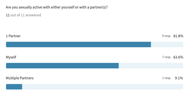
1. 60% of users had never heard of Jiaya’s work.
Being familiar with this research is helpful, but the quiz element allows for a clear understanding for users who haven’t seen the Netflix show.
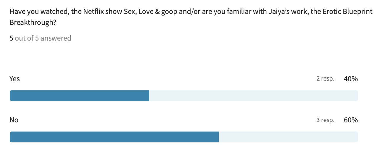
2. Users stated that they had taken a quiz about sex, but felt the source didn’t hold much credibility or make an impact on their sex education and/or sexual experiences.

3. Users mentioned they use apps such as Grindr, Tinder, Scruff, Hinge, and Feeld.
My competitor analysis shows that these apps are only about dating and hooking up. They don’t hold space for sex education or healing and are often not as inclusive, mainly being designed for only one sexual preference, rather than open and safe for all.

4. 100% of users have never seen a sex therapist or coach.
We all know that there’s a lot of stigma and shame around going to therapy, but adding on sexual dysfunction or trauma can feel even more daunting. I think this shows that sex therapy isn’t as accessible or sought after to heal oneself. This is an area of opportunity in the build of this app.
3 in-depth questions and responses
Q4: Do you feel that being matched with a partner with the same sexual desire /arousal as you would lead to a more fulfilling encounter? Or would some variety be ideal? Explain your thoughts.
-
I'm not sure... I think that as with any type of test there are going to be some areas of overlap and areas of individuality. The strength of a relationship seems to show up in how well each partner is able to empathize and explore the other's world outside the areas of overlap. Like a venn diagram...
-
I think a willingness to be open is more ideal, but some common desire is great to lead up to openness/variety
-
Yes
-
I think it could go either way, having the same desires at first would be nice because it would be comfortable, but down the road differences in desires may lead to more adventures…
-
Not entirely sure what is meant by “sexual desire / arousal” but having a similar sexual appetite and drive is crucial/ideal. The least engaging dating apps are far too broad and don’t allow to filter by sexual appetite/interests.
Q7: Do you feel society has an adequate understanding of sex education? How so?
-
Not in the slightest. We teach fear and abstinence. We negate anything to do with pleasure and leave the education to porn... which is typically not a demonstration of equitable or loving interaction between partners in hetero/MF scenarios. It's horrible, the lack of information and communication around our bodies and sex.
-
yes
-
no
-
No, I feel like sex is such a taboo subject and the thought of sex education to lots of parents makes them feel like it will encourage their children to have sex. This can lead to dangerous sex practices in my opinion so the more accurate information given to young adults and adolescents the better!
-
Nope.
Q8: Describe how a deeper connection, fulfilling intimacy, and satisfying sex would impact your life.
-
It would help to remove the layers of shame from a deeply religious upbringing. It would make me feel empowered. It would bring me closer to my partner. It would bring a greater level of closeness.
-
I think it contributes to overall well-being. If you fulfilled and validated emotionally, physically, sexually that spills into how you feel about yourself and the people around you. it informs your happiness and strengthens your ability to make decisions that maintain feeling fulfilled.
-
It would make me feel good.
-
Sex to me can bring you closer in many ways even ways outside of sexual acts. The better and more understanding sex you have the better the connections in every day life outside of sex becomes-in my opinion.
-
N/A

Sex as a color
Participants were asked what colors they would select in reference to sex. Results below.
Empathy Mapping + Personas

Empathy maps
Once I finished with all my research, I then went about the task of creating an empathy map. As I started, I quickly realized that I would need to generate more than one ideal persona, hence three empathy maps. With the broad range of users and user gender identities, to remain inclusive and attempt to represent all, it made sense for this project to have more than one user flow. I was able to condense my research into three different empathy maps and personas that felt inclusive.

Personas
To create these personas I split my research into three different sexual preferences as the main differentiator. But then I created three different motivation charts that all together make up the information that was provided to me in my user survey and interviews.
REsearch Key findings
My research has been plentiful and juicy. Here is my simple summation of what I’ve learned:
Users struggle with sex.
Users struggle with understanding themselves as sexual beings.
Users want to have a better connection to themselves and others.
Users take in information about sex differently.

Define
“If you don’t know where you are going, you’ll end up someplace else.” — Yogi Berra
In this Section
Feature Roadmap
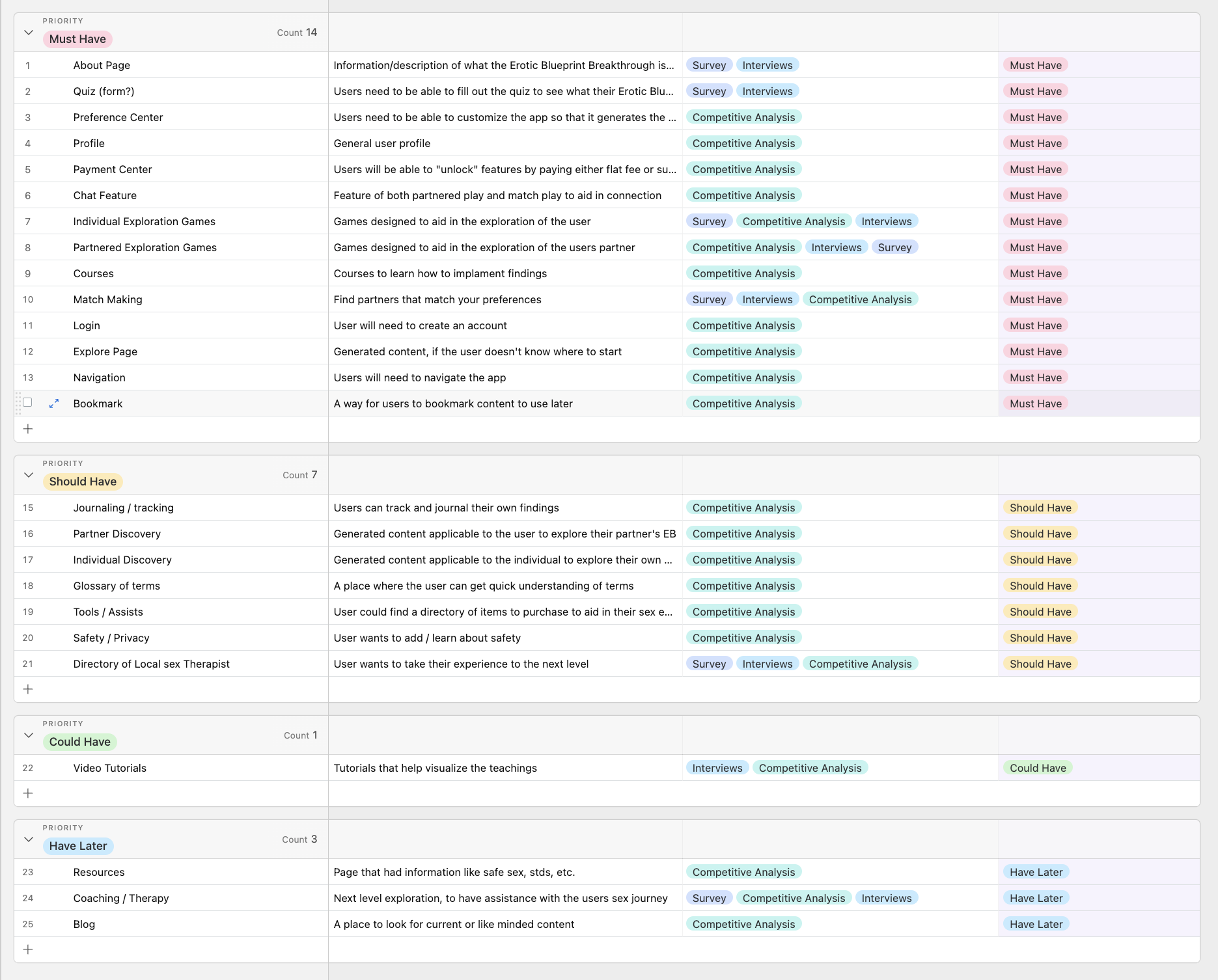
Feature Roadmap
I built the feature roadmap in a similar way as my other projects. I realized that the competitive analysis was the main drive in what features I should have. Even though my research consisted of 1:1 user interviews and a user survey, I noticed in order to be a competitor in the market and serve my three personas, the app will have to have all the features that users want, need, and are familiar with from other apps like Tinder, and Kama.

Tools
See how I quickly create and organize my feature roadmap in AirTable. See my note about how tools can make or break a project.
-
Tools.
Finding tools that help your process be more efficient and effective is overlooked. I believe that we can get stuck using the same tools because a “that’s the way we’ve always done it” has been said to you. To me that’s backwards and probably a red flag against your employer.
It takes being curious and staying in the know to play around with new tools to see how they can help your workflow.
My previous work experience has proven this notion time and time again. In two previous leadership roles, I have successfully researched, tested, introduced, and integrated new tools into the workflow. This effort increased productivity and reduced communication errors across departments.
Airtable is one of them. I still use it for all my projects, both professionally and personally.

Ideate
Sometimes we’re ebbing and sometimes we’re flowing.
In this Section
Site Map
Task Flow
User Flow
Low-Fidelity Wireframes
Site Map + Task flow + USER FLOW

Site Map
My site map was fairly simple to build. It had all the same components as what you would see for website navigation. The process of creating this was challenging for me. I struggled to visualize the main navigation, which meant I struggled to place all the interior links. All my previous projects were websites, or responsive designs, whereas this project is solely an application with a different skeleton. To complete this phase of the project I simply deconstructed a similar app and then the placement made more sense.

TAsk Flow
This task flow was the most complicated I had created yet. It took nearly six revisions with my mentor. The rundown:
The first task that everyone would do when using the app, is The Erotic Blueprint Breakthrough Quiz. This would give the user an understanding of their sexual profile according to Jaiya’s research and Blueprint descriptions.
The second task that a user could take would be as an individual, meaning not looking to connect with others and not in a partnered situation looking for insight about that. They are an individual user looking to use the app to learn more about themselves.
The third task escalates that user to a seeking member. Meaning, they are looking to find a match based on their Erotic Blueprint. It also means this user could be looking to understand themselves as well.
The fourth flow is the Mac daddy of them all. It’s a partnered flow that has access to all the features of the app. From understanding themselves to seeking matches, but also in partnering with another app user.

User Flow
The user flow builds upon the task flow by adding in the decision points that the user would make during the journey. The most notable element in these flows is the paywalls that appear when escalating a membership through each stage. Those can be clearly indicated by a red line sectioning the flow.
This was the first time I had worked with paywalls. To see how they work inside a user flow was fascinating.
Lo-FI Wireframes
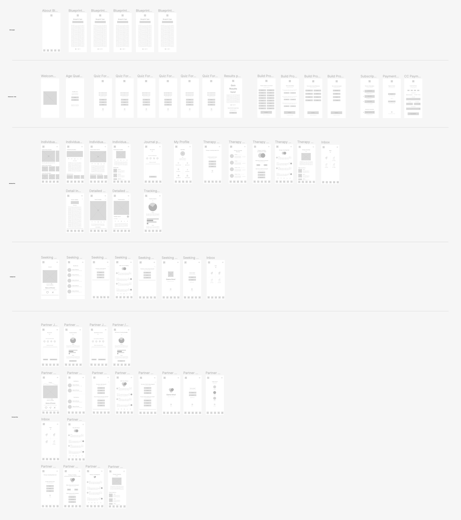
Starting Point
This was the first time I didn’t start building my wireframes using pencil and paper. I went straight to Figma and organized my sections based on my task and user flows. It seemed overwhelming to know which screens to build, but as I got going it became more and more clear.
-
Wow, moments.
Tasks and user flows have been a tricky part of my journey in learning UX design. In a lot of ways looking at a flow like this is like looking at a piece of code. It’s a language that I haven’t mastered yet. As a visual thinker, I see the website or app in my head first and then deconstruct it. Which isn’t the process in UX design, it’s a re-wiring that I’m grasping.
However, when it came to building the flow for this project I felt nothing but accomplishment.
Needless to say, this was a complicated and wildly challenging endeavor and I’m pleased with the outcome.

Prototype
Seeing is believing.
In this Section
Mood board
Branding
UI Kit
High-Fidelity Wireframes
High-Fidelity Prototype
Branding

Mood board
My mood board was built on Pinterest. I hunted for imagery that reflected sex and intimacy in an artful way. I used imagery similar to topographical mapping as a way to visualize an orgasm and a literal blueprint. Lastly, gradient colors that matched what my users suggested sex looked like to them seemed like a good way to set the mood.

Logo exploration
My logo exploration went in two different directions. At first, I thought I could represent the complication of sex through two opposing typefaces, but that direction ended up looking like an 80’s romance novel cover. Fabio wasn’t the vibe I was going for. I liked the idea of the lines acting as both a topographical map and showing the pulsation of an orgasm. The typeface I found felt architectural, which was a nod to the idea that we all have a blueprint.

Ui Kit
Getting the UI kit together was a very fun task. I love the colors that are at play and the simplicity of the iconography. By incorporating the three types of imagery, I’m honoring my research, as my users mentioned having all three types, illustrations, artful, and realistic combined.
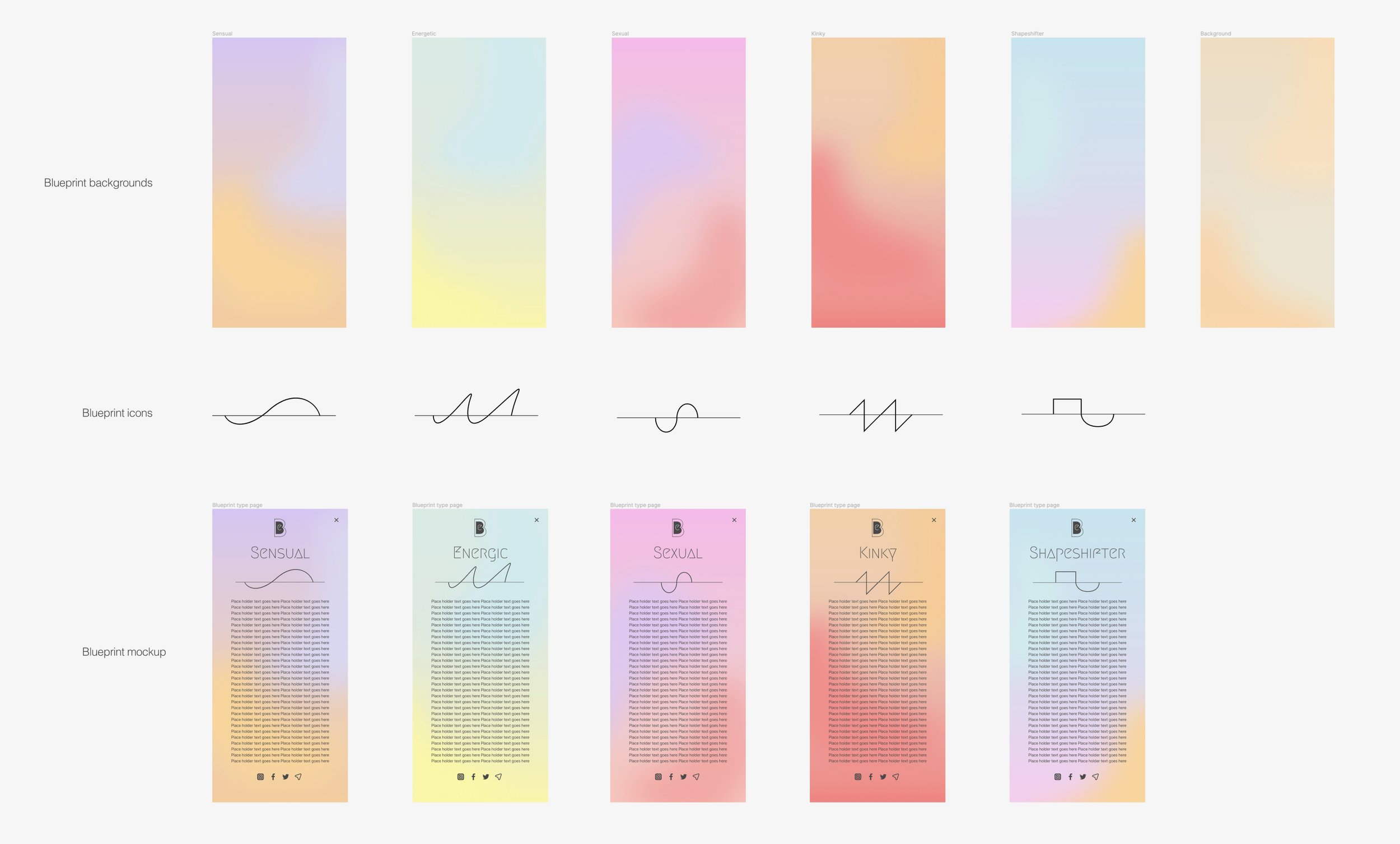
backgrounds
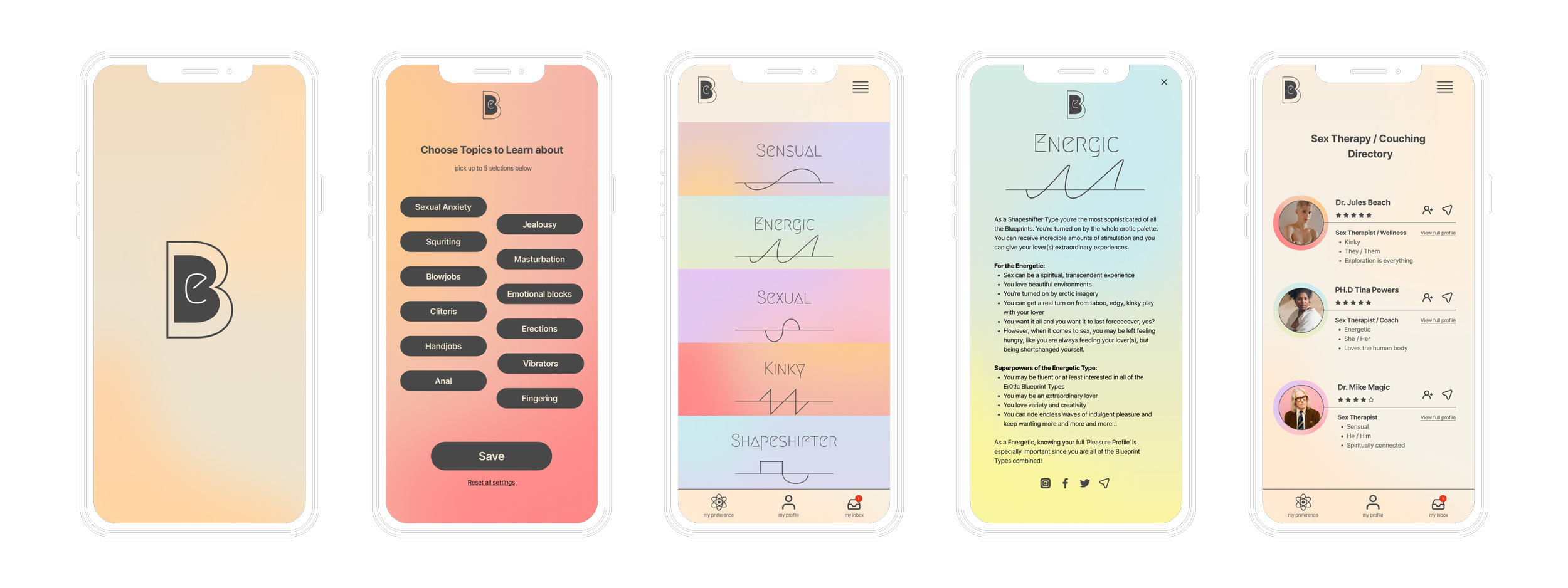
There are five different erotic blueprints according to Jaiya’s work. I wanted to make a gradient background for each. I wanted the vibe to fit the description she gives, as well as, include the colors from my user interviews. Lastly, I felt that giving each erotic blueprint its own logo would be a cool way for users to differentiate the five erotic blueprints. I used a line, like a symmetric reader as if it was measuring the type of orgasm each blueprint might have.
-
Gradients.
When I first came up with the idea of having a different gradient for each erotic blueprint I originally thought I would find a stock version and buy them. As you can imagine, that didn’t go the way I had hoped. Finding gradients that would fit the description of each blueprint and stay consistent was impossible.
So I learned how to make them in Figma. I watched a YouTube video and played around until I got the result I had envisioned.
I’m so pleased with not only the final result but also with my ability to research how to design new elements in Figma and execute them.
I find this to be a valuable skill not only in my professional life but in my personal life too.

hi-fi wireframe
I loved the way this app came together. Our lo-fi wireframes seamlessly transition into hi-fi wireframes. Once I had the main quiz flow built out it was easy to add it to the seeking and partnered flows.
hi-fi Prototypes
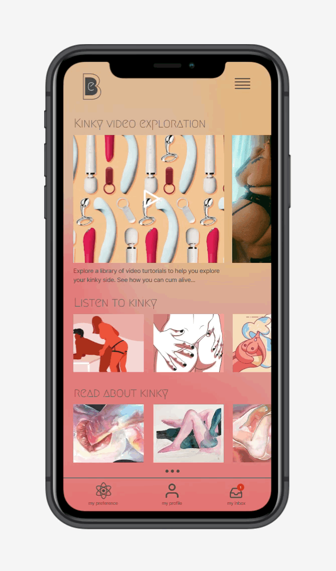
Three versions of my prototype were built to accommodate the three task and user flows. I broke the three flows into six examples below that make up the entirety of the app. Each flow uncovers features of the app and as you adjust the subscription you can access more features behind each paywall.

Quiz flow

Building preferences + Paying
for subscription flow
About Jaiya + Blueprint descriptions
Therapy flow

Match Flow

Partnered Flow +
Usability Testing
But will the app offer you a deeper connection,
more fulfilling intimacy, and satisfying sex?
In this Section
User Testing
Affinity Mapping
Priority Revisions

User Testing
My usability test plan is very straightforward. The goal is to perform 1:1 interviews with users to observe them interacting with the three prototype flows. My desired outcome is that users find the app concept useful leading to a deeper connection, more fulfilling intimacy and more satisfying sex.
Usability Testing Results

Q1: How would you rate your experience taking the quiz and building a profile? (1=terrible to 10=absolutely)
Q2: Rate your experience connecting with both sex professionals and other individuals on the app. (1=terrible to 10=absolutely)
P1: Yes I was. Once I found it, it worked perfectly.
P2: It feels easy, with clear icons. I think it is easily understood. Everything worked perfectly. There were the right amount icons so that you could keep moving but not get bogged down.
P3: It was easy enough to navigate. I do think there should be labels at the bottom of the main navigation so that it’s super clear. I think if the app was real it would be very intuitive to go through, but the prototype seemed a little fumbled.
Q3: Rate your experience connecting with both sex professionals and other individuals on the app. (1=terrible to 10=absolutely)
P1: I'm sorry this probably isn't helpful, but I felt after going through the app that it was very thorough and well thought out, I can't think of anything I would change at this moment!
P2: I actually wouldn’t change anything. It’s really thought out and easy to use.
P3: Nothing - I think the app is pretty clear.

Q4: Rate your experience connecting with both sex professionals and other individuals on the app. (1=terrible to 10=absolutely)

Q5: How likely would you recommend this app to your friends, family, or (potential) partner(s)?
(1= hell no to 10=absolutely)
Q6: What did you find most frustrating when maneuvering through the three flows on the app? Explain?
P1: At first I was a bit confused because I was using my phone and was unclear about how exactly everything should be working, but after speaking with the developer ( ;) ) I was able to get my questions answered and everything became more clear.
P2: Nothing - it was easy to navigate.
P3: Just the prototype was hard to navigate, but otherwise seemed easy.
Q7: Rate your experience connecting with both sex professionals and other individuals on the app. (1=terrible to 10=absolutely)
P1: I really enjoyed the feature of the app that pairs you with individuals, I think this is a great idea and is much more intricately thought out than a basic "matching" app. I feel like this app has the potential to be very successful because of that!
P2: I think I would make the shopping section more prevalent. So that you and your partner could buy stuff to have more fun with sex!!!
P2: If there was a way to purchase items, I saw it on the video tutorial page, but maybe making that more of a highlight. Then the labels for the navigation.
-
Project fatigue. A lesson learned.
If I were to repeat this project I would have mirrored my usability test after the initial research plan. I started gathering information by conducting a user survey and doing several 1:1 interviews. So to mirror that, I should’ve done a usability survey and then performed 1:1 interviews.
This project was the most challenging I’ve done yet. There were a lot of components to it and many many group crits/mentor meetings to discuss improvements and iterations. I can tell that towards the end of the project I was fatigued by the work, and my usability testing suffered because of it. This is one of the most critical elements of the whole project. It was the time to honor the hard work I put in and prove that my solution works and meets the needs of the users.
Don’t get me wrong, I think my testing was successful, it was just a smaller participant group than I wanted. Now I know for the future to push hard toward the end to get those results that will sell the worth of the project.

Affinity Map
I used three categories to help me divide the feedback notes and then separated them into “wins” or “needs work” sections. This method helps me clearly focus on my priority revisions.

Priority revisions
I chose to focus on three priority revisions based on the redundancy of the feedback. Here’s what the changes are and why:
Navigation labels
User needs: Users noted the bottom navigation had clear icons, but they would feel more confident in the icons if they were labeled. I added the label under the icon, with a bit more breathing room in the bottom navigation for finger spacing.
Purchasing
User needs: Users mentioned they wanted more access to purchase and information about products they see in the content. They mentioned they would like it to be easy to buy items right from the app.
Swapped out like button for a
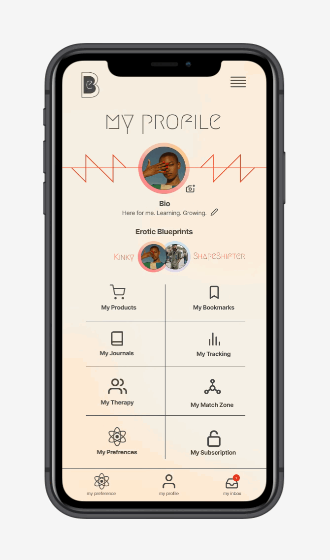
“my products” button. Figured the like button is similar to bookmarking content. However, having a product list to shop from would be a win for businesses and the user to easily find goods they see in the content.For consistency's sake, I swapped out the like button for a “my products” button. Seen here on the “My profile page”
My preferences page
User needs: Users mentioned they felt overwhelmed by the preference page options. I simplified that page and categorized the options into three levels of kink, low, and medium high.
Final prototype
Erotic Blueprint
“Deeper connection,
fulfilling intimacy and satisfying sex”